How Instagram secretly started competing with Pinterest
On December 21st, 2016, with 89 words and a single image, Instagram took the first step onto Pinterest’s turf:
This feature was just as tiny as the article used to describe it.
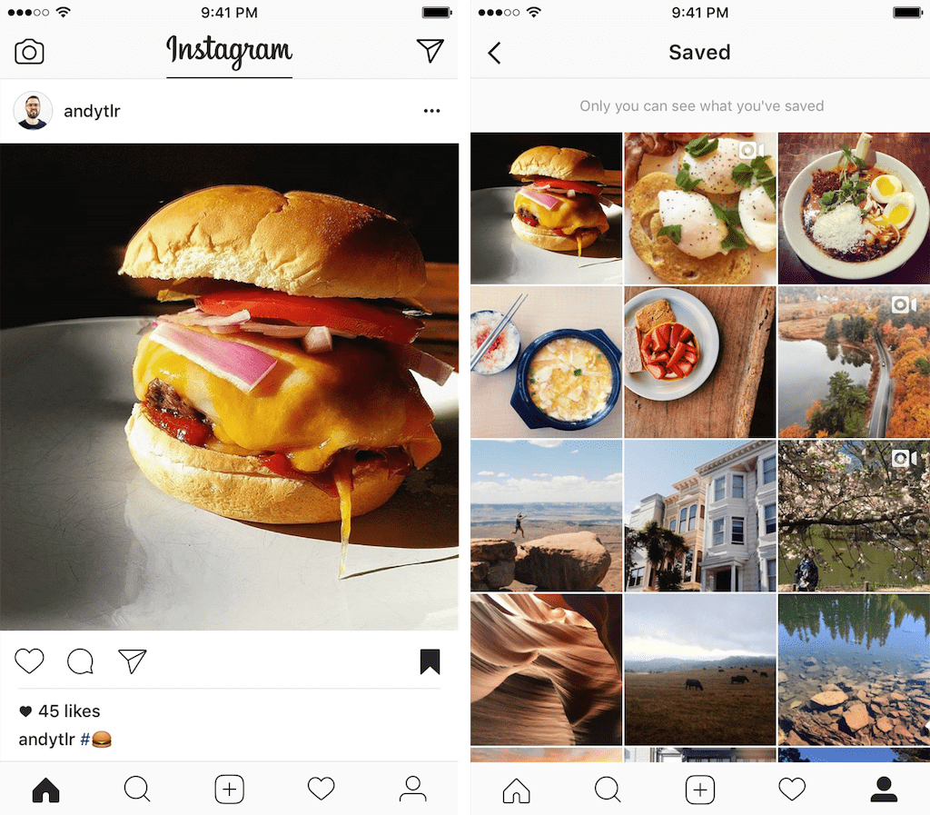
A new icon showed up on every Instagram post. When the icon was clicked, the post got stored in a private “saved” screen within the person’s own profile.
Here’s what it looked like:
Instagram revealed their next move on April 17th, 2017:
Introducing New Ways to Organize Your Saved Posts
This single line explained their entire strategy:
“Since we introduced the ability to save posts in December, 46% of Instagrammers have saved at least one post.”
In hindsight, it’s clear that Instagram’s first move in December of 2016 was extremely purposeful.
The tiny feature was designed to make sure people were actually tapping the save icon, before Instagram made their second move.
Then Instagram explained where they were going:
“Whether you want to scope out your next daytrip, revisit your favorite artists’ illustrations or always have your favorite animal videos on hand, collections can help you keep track of the posts you want to remember.”
The four months in-between Instagram’s first and second move seemed to have been quite valuable. The Instagram team learned exactly how people were using the new feature and included anecdotes as part of their product marketing on the day they launched collections.
Then TechCrunch reported that Jane Manchun Wong discovered how Instagram added code for an unreleased public collections feature. This is Instagram’s third move towards Pinterest.
I think the product strategy behind these moves is brilliant.
Step One
If Instagram can take such a small step as their step one, why shouldn’t we with our own products?
At FYI, we’ve got a name for this type of small but critical starting point.
We call it a “Step One.”
You don’t come up with it randomly out of thin air.
A Step One is a deliberate starting point that has been informed by research and grounded by what people are doing with your product.
Here’s a specific example.
Within the FYI interface, we show document listings just about everywhere in the app. This helps people find documents faster without having to search for them.
People click on various parts of each document listing. The place they click most often is on the document title to open it.
A common reason to open the document from FYI is to share it. To do that without FYI, people have to find the document they want to share, open it, wait for it to load, hit the share button and fumble with the interface until they’ve shared it.
At least half a dozen clicks and entering email addresses, just to share a single document.
We came up with a feature to share documents right from FYI in 3 clicks or less without typing.
The feature would involve adding a button to each document listing that would show a list of people who you can share the document with in one click.
This wasn’t a feature that could be built in a couple of days or even a week.
Our Step One for this document sharing feature was to add a button to each document listing and see if people would start to engage with it in the first place.
The goal was to find a way to learn if people would even try to use the feature before we built it.
For this Step One, we did a variation on what’s commonly called a “painted door” or “fake door” test.
If people didn’t click the button treatment we created, we would iterate it until we got enough people clicking it.
After we shipped our Step One, people noticed.
Great UI research element in @usefyi pic.twitter.com/aoeVin0B0t
— Bryan Harris (@Harris_Bryan) April 22, 2019
And there was even a recorded video of the interaction posted to Twitter:
Love this tactic for user research in products. Check out this interaction inside of @usefyi. Click on something you think is a feature and get this instead -> https://t.co/EElkrY4oz6 (And using something like Drift for feedback collection makes it super lightweight.)
— Ruben Gamez (@earthlingworks) May 24, 2019
When the button was clicked, we popped up a Drift chat message and asked people what they were expecting to happen when they clicked the button.
This was the fastest way for us to learn not only if people would click the button but also their expectations of what would happen when they did.
It turned out that most people who responded to it said they would expect to share the document after clicking the button.
Bingo. Mission accomplished.
The learnings from our Step One made us more confident in spending the time to build out the feature. We knew that people would see it, click it and expect to be able to share the document after clicking the button.
The full sharing feature is now live in FYI. Sign up for free to try it for yourself.
The Step One Mindset
When thinking about a new feature, the tendency is to focus on what the final version of it will be. After people are already using it and it has all the bells and whistles.
Instead, change your mindset to focus on how to start with this final version in mind. Then determine what the right first step is that you can take. Your goal is to kickstart the interaction or behavior within your existing product so you can ensure that the feature gets adoption and is used.
Instagram did it by building something tiny, an icon to privately save any post. This was their first step towards competing directly with Pinterest.
We did it by running a tiny experiment with a single button. This was our first step towards adding document sharing into FYI.
What’s Step One for your next big feature?