The Best Chrome Color Picker Will Surprise You
Looking for a color picker?
Chrome already has a color picker built in. You don’t need an extension.
In some cases, you’ll be able to grab the color of a web element with two clicks.
I’ll show you exactly how this works.
Open dev tools (CMD+Shift+C on a Mac, CTRL+Shift+J on Windows).
When you mouse over an element in dev tools, you’ll see basic details like font and color:

What about getting colors from images or logos?
For this, you’ll need an eyedropper tool. There’s also an eyedropper color picker built into Chrome. Here’s where to find it and how to use it.
Using Chrome’s built-in color picker
To use Chrome’s built-in color picker tool, you don’t need to install anything. You don’t even need to get under the hood in Chrome Settings. But the color picker is tucked away in dev tools. You have to know where to look. Once you’ve found it once, though, it’s easy. Here’s the step-by-step.
Step 1: Open developer tools
The first thing to do is to open dev tools. You can do that with keyboard shortcuts:
- Mac: CMD+Shift+C or CMD+Option/Alt+J
- Windows, Linux, Chrome OS: CTRL+Shift+J
Alternatively, right-click or CTRL+click on the element you want to inspect and select “Inspect” from the drop-down.
You can also open dev tools from the Chrome menu under “More tools.”
Step 2: Find a CSS element with a color quality
Once you’re in dev tools, look for a CSS element that has the quality of color.
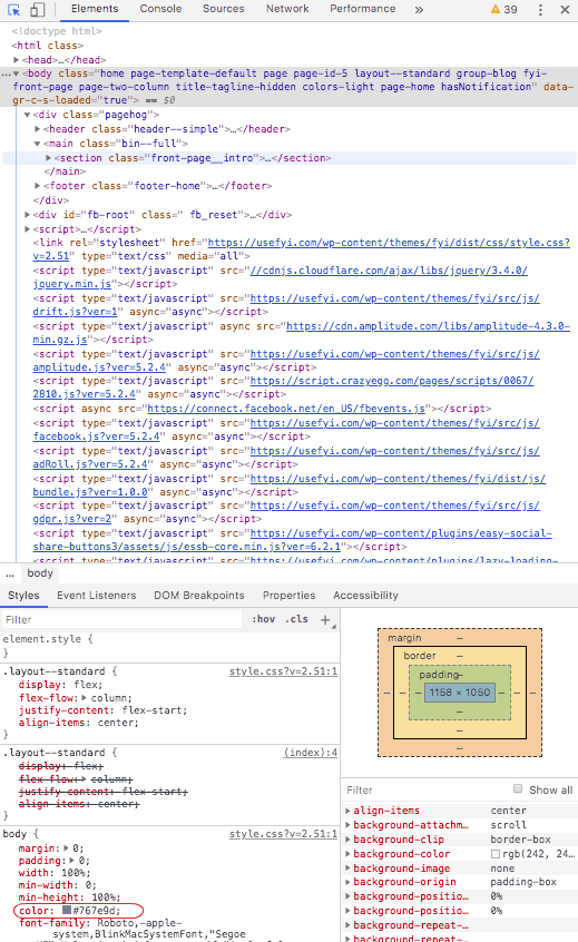
By default, dev tools opens to “Elements” with “Styles” open in the lower panel. Color should be in the body { section.
Step 3: Click on the color
There’s a small square next to the hex code of the color that shows you what it actually looks like. Click that square.
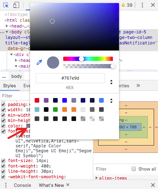
You’ll see the color picker tool, display code for the color, and some other controls we’ll explore below.
Hover over anything outside dev tools, and you’ll see a cross-hairs instead of the cursor, with a grid attached that lets you make very precise decisions about what color you want to see:

The red-outlined central square is the color you’re selecting, so by mousing slowly over images you can select color right down to the pixel. The panel in dev tools will show you the display value of whatever color you click on.
When you click on a color, the value is displayed in the color picker panel, along with a circular visual sample.
The Chrome color picker UI
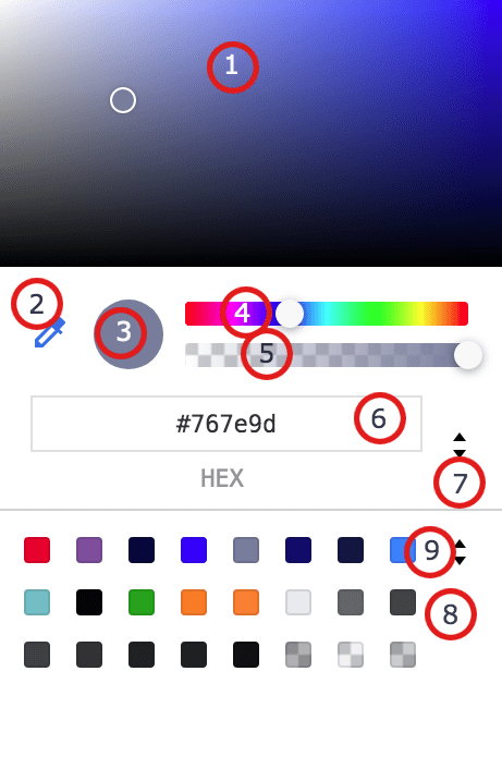
Navigating your way around the user interface of Chrome color picker, you’ll find the following features:
- Color gradient picker. Fine control over color lightness and tone. Move the circle around to change colors and see the display value of your chosen color.
- Eyedropper. Pick up and identify colors from websites, including from PNGs and other graphic elements, down to the pixel.
- Copy to clipboard. Copies the display value to your clipboard.
- Hue. The slider lets you control the underlying color, independent of intensity, lightness, or contrast. Then you can use the gradient tool for fine-tuning.
- Opacity. Gives you full control, from 100% opacity to full transparency.
- Display value. Shows the value of the color in hex, RGBA, or HSLA—choose in the display value control next to it.
- Display value control. This switches between RGBA, HSLA, and hex.
- Color palette. A readymade palette of colors to choose from.
- Color palette switcher. Switch between a material design palette, a page colors palette, and a custom palette. Chrome will default to a palette based on the colors it discovers in the stylesheet of the web page you’re viewing.
Using Chrome’s color picker with Google Slides
Let’s say you want to brand your Slides presentation with the colors from your website. It’s simple to do, and if you make a bunch of presentations or pitch decks it’s a good idea to create custom templates in your brand colors so you only have to go through this process once or twice.
Acquiring color display values
Start on your website. Open the Chrome color picker using the steps above and pick the color you want to use as your theme background. I’m using the light blue-gray from the background of the FYI website:
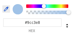
Copy the display value and open Slides.
Modifying Slides
Slides usually starts with the Simple Light theme—just black text on a white background.
Go to the toolbar at the top of Slides and click “Background.”

Under the readymade theme colors and Slides’ own color palette is the “Custom” option, which is what we’re interested in.
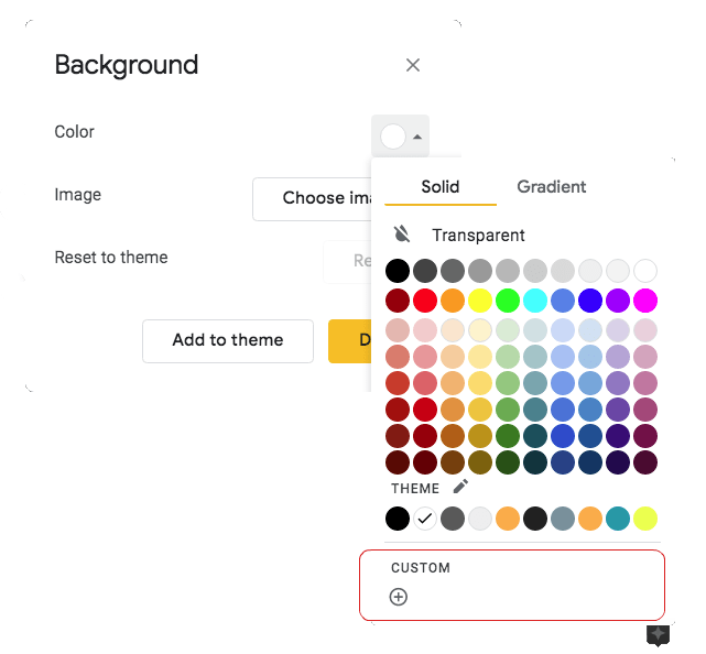
Click that, and you can enter a display value. Paste the display value you copied from your website here.
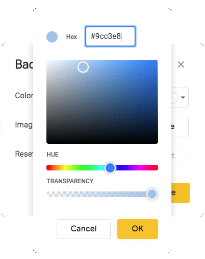
The new tile in this theme now looks like this:

But the theme is still called Simple Light.
Creating a custom theme
To address that, go to Slide in the top menu of Slides and choose “Edit Master.” That lets you edit the master slide for the theme; changes made here cascade down to all the other slides. Click “Rename” next to the theme name, and you can name the custom theme:

Once you do this, your custom theme will be at the top of your theme options when you open Slides:

To change other elements—text color, image colors, or text box backgrounds, for instance—the process is the same. Find the color menu for the element, select the Custom field, copy the display value you want from your website and paste it into the Custom field. If you want to make it a permanent feature of a custom theme, just follow the custom theme steps above when you’re done.
Alternative to Chrome’s color picker
While Chrome’s color picker is good enough for most tasks, it’s not a full-featured standalone tool. If that’s what you’re looking for, consider adding to your Chrome extensions with a specialized color picker like ColorZilla. (ColorZilla has a ton of additional features, and it’s also secure, which can’t be said of all color picker extensions.)
ColorZilla: Feature-rich color-picking workhorse
Colorzilla gives you everything Chrome’s inbuilt color picker gives you, plus a few additional tools.
You can install ColorZilla from the Chrome Web Store here.
Select it from the extensions bar to see the dropdown menu:
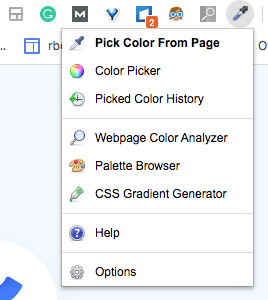
The interface is a little more complex than Chrome’s. Select “Pick Color From Page” and you get a tiny cross that lets you select the color of a pixel, as well as options for averages across ranges of pixels:

A header bar shows you a color sample, plus display values in RGB, hex, and HSLA.
Those values are then transferred over to the color picker, where you can copy them and alter the color using gradient and palette tools.
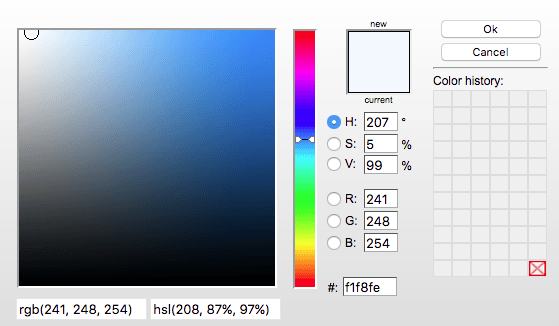
You’ll see options to copy the selected color to the clipboard and to resample the last location. But what’s more interesting is the next group of options, which includes a web page color analyzer:

Granted, these are coming from the stylesheet and you could open dev tools, find it, search it for colors… but this took two clicks. You can show up at a site, decide you like the look of it and get its whole color palette in seconds. And this also lets staff who aren’t designers add a little branding to communications, presentations, and more.
There’s also a Palette Browser you can use to search for colors from a range of readymade palettes:
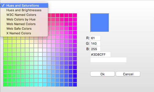
Finally, there’s a CSS gradient editor that opens in a new window from ColorZilla’s website to this page.
This is a Photoshop-like CSS gradient tool that lets you create gradual blends between colors.
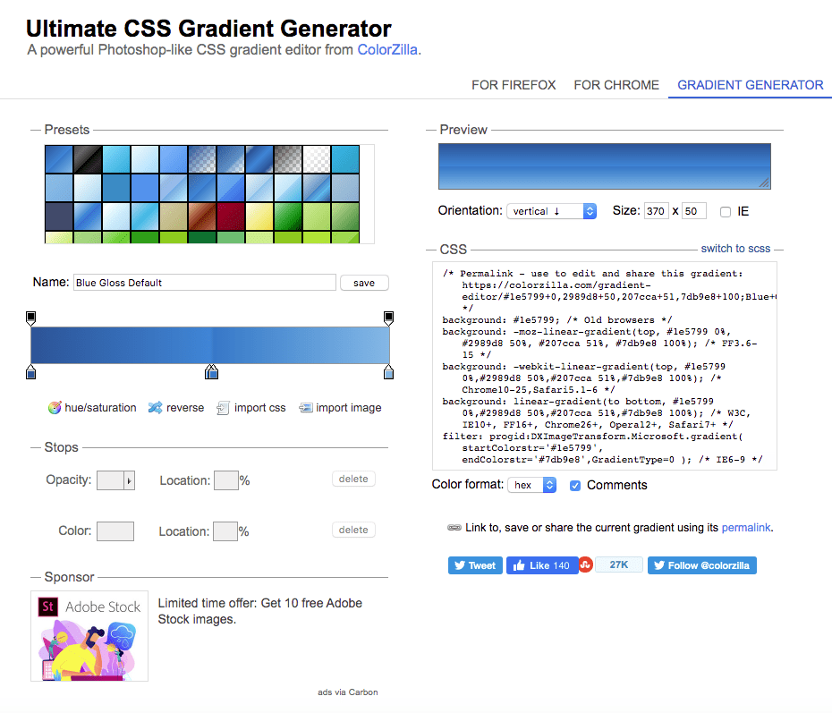
It automatically creates the CSS for your chosen effect in the CSS box, where you can copy it and drop it into your stylesheet.
ColorZilla does a few other impressive things. It lets you get the colors of dynamic elements like hovered links, pick up colors even from Flash objects, and pick colors with keyboard shortcuts. Though currently in beta, if you’re going to do a lot of color sampling and picking, ColorZilla is a lot quicker, easier to use, and more feature-rich than Chrome’s color picker.

