The Ultimate Manual to Airtable Dashboards
Airtable is a popular piece of software that puts together the best features of spreadsheets and databases. This provides a better ability to visualize information that shows how your business or organization is performing.
Dashboards are an important tool Airtable uses to further drill down on metrics and statistics, giving an even deeper level of insight in a visually pleasing manner.
What Are Airtable Dashboards Anyway?
After storing data inside Airtable, Dashboards provide an ability for organizations and businesses to visualize that data.
Airtable provides data storage and organization by blending the best features of spreadsheets and databases. However, spreadsheets and databases don’t always provide the easiest way to visualize relationships among pieces of data.
That’s where Airtable Dashboards enter the picture. Think of them as an in-depth software package that simplifies creating a visual picture of your data. You can better understand the information through Dashboards versus looking at a grid of numbers in a spreadsheet.
Additionally, Airtable Dashboards allow you to limit the amount of data in the display. This makes the data even more useful from a visual standpoint, as it creates less clutter when the business is trying to make a strategic decision. Irrelevant data won’t distract decision-makers like you when you’re looking at a Dashboard about a particular topic.
Airtable Pricing
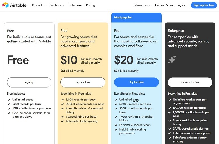
Airtable customers can select from four different tiers. All of the tiers, including the Free tier, provide an unlimited number of bases, which is a key component of using Airtable Dashboards.
However, only the two highest pricing tiers will allow customers to be able to make use of apps, which are necessary to set up and use Dashboards. Only the Pro and Enterprise tiers allow the use of apps.
- Free: The Free tier is not a trial period, it’s an actual level of access to Airtable. Because users cannot use apps with bases in the Free tier, however, they will not be able to use Airtable Dashboards in the Free tier.
- Plus: The Plus tier costs $10 to $12 per month per user. However, it also cannot make use of apps, so subscribers at this level cannot use Airtable Dashboards either.
- Pro: The Pro tier costs $20 to $24 per month per user. Subscribers in this tier will be able to access apps from the Airtable Marketplace, so they can use Airtable Dashboards. The Pro includes a limit of 50,000 records per base and up to 20 GB of file storage per base. As with any tier in Airtable, users in the Pro tier do not have to deal with a limit on the number of bases they can have.
- Enterprise: Airtable aims the Enterprise tier at large companies that need the highest levels of Airtable security and features. It has all of the features of the Pro tier, including the ability to make use of apps and Dashboards. Customers will need to contact Airtable directly to receive a pricing quote.
How Airtable Dashboards Work
When preparing to use Airtable Dashboards, it helps to understand some of the Airtable features you need to master before advancing to building Dashboards.
Bases in Airtable
Airtable’s developers use the term “bases” to refer to the database component of the software. One base, or database, will contain all of the data and files related to a project. Users can have an unlimited number of bases in all pricing tiers of Airtable.
When viewing the homepage in Airtable, users will see a series of square icons. Each of these icons represents a base with the user’s account.
Within the base, the file will consist of different tables. These are similar to a spreadsheet that may have a few different worksheets, allowing the user to sort the data.
Apps in Airtable
In the most basic sense, apps are at the heart of creating Dashboards. The Dashboards consist of an app monitoring a specific collection of data in a base in Airtable.
The apps within Airtable give users the ability to visualize data, which can be helpful in almost any aspect of making a business or organization run smoother.
The app is a part of Airtable. It sits on top of the data a customer stores within an Airtable base. The app actively monitors the data. Should that data change at some point, the app will immediately reflect that change within any of the affected Airtable Dashboards. These updates occur automatically.
Because the apps are part of Airtable, they run seamlessly. There’s no need to try to translate third-party software or to create an integration with a different software package when using an app. It simply operates as if it is part of the Airtable software.
Users can find apps that operate in Airtable through the App Marketplace.
Making Use of Dashboards
Dashboards are not limited to Airtable, nor are they an Airtable invention. The term Dashboard is a general term among those who analyze data for a living. Anytime someone makes use of a graphical element to analyze data, developers refer to this element as a Dashboard.
By making use of Dashboards within its software, Airtable attempts to present information in an easily digestible and highly visual manner.
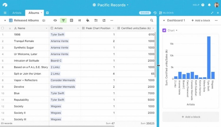
Think of Airtable’s Dashboards as data visualization tools. Whether using a pie chart, line graph, bar chart, or a summation of numbers from the table, Dashboards can deliver information in a variety of ways. Some of the ways organizations make use of Dashboards in Airtable to visualize important information include:
- Current inventory: Managers can check the status of product availability in a warehouse at a glance through the use of Dashboards that pull the data out of the base in Airtable.
- Inventory trends: When wondering whether the organization should order more product to prepare for a potentially busy season for customers, teams can use Dashboards to analyze sales data from previous years to determine when they are preparing to enter a busy season of the sales calendar.
- KPI: Many businesses and organizations rely on Dashboards to help them understand key performance indicators (KPIs) for a department, an individual employee, or the organization as a whole.
- Sales results: Team managers can quickly generate an easy-to-digest graphical representation of how close the team or an individual is to a sales goal, hopefully creating the motivation to reach the goal. The sales team members can see at a glance where they stand, rather than trying to work through a series of numbers in a spreadsheet.
Improved Business Performance
Ultimately, businesses and organizations are looking for any opportunity to gain an edge over the competition. Using data visualization tools to showcase various KPIs and other important aspects of running the business provide a few important advantages for improving performance.
- Saving time: Rather than having to dig through rows and columns of numbers in a spreadsheet, Dashboards present the data in a visually pleasing manner that saves time when collecting information ahead of a decision.
- Fresh data: Because Airtable Dashboards update automatically whenever users make changes to the data in the base, the graphical data is always fresh and accurate.
- More informed decisions: Business leaders and team managers can make decisions based on up-to-date data that they can view whenever they want through Airtable Dashboards. Having accurate data that’s easy to understand leads to better decisions.
Example 1: Creating a Dashboard With the Chart App
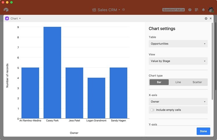
Airtable offers a popular chart app that delivers multiple options for visualizing records, including the following visualization tools.
- Bar chart
- Line graph
- Pie chart
- Donut chart
- Scatter plot
After adding the chart app, the user will need to select the type of visualization tool to use.
To add the data to use for the chart, the user will first need to select the data to use for the X-axis, which is the horizontal axis in a bar chart. This could be a list of salespeople, the various stages of a pipeline, a series of dates, or different customer accounts.
Next, the user will select the data to use for the Y-axis, which is the vertical axis in a bar chart. Commonly, the Y-axis will contain a number, usually the number of records for each item on the X-axis. This could be a total amount of money generated in sales or a number of products in inventory.
As part of the Chart app in an Airtable Dashboard, users can select how the Dashboard will sort the data. To make the data easier to visualize, some users may choose to sort a bar chart where the largest bars are on the left and the smallest bars are on the right, for example.
Example 2: Creating a Dashboard With the Summary App
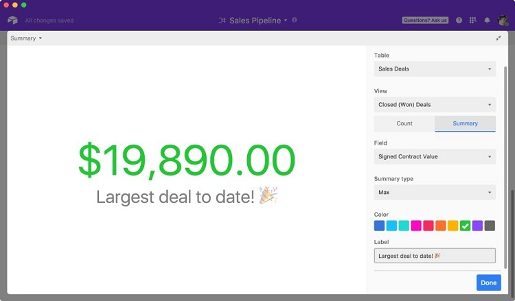
When thinking about some of the most common ways people use spreadsheets, they often involve creating a summation of a series of values. The Summary app in Airtable allows users to create a visual representation of a sum of values. This is a good way to keep track of the progress toward a sales or fundraising goal visually, so everyone knows where things stand at all times.
After selecting the Summary app to create the Airtable Dashboard, users will need to select the table from which to pull the data. The user then will have two options for displaying the summary of the values.
- Count: When selecting count, the user is seeking a calculation of the number of records in a particular table. This may be useful for counting the number of customers a business currently has, where the spreadsheet contains the name of each customer. The Airtable Dashboard will simply count each name in the record.
- Summary: When selecting summary, the user wants to add the values of all of the records in the table. This is a useful way to display a calculation of the total amount of money raised for a charity event, where the spreadsheet contains a separate record for each person’s donation. With summary, the user can choose to display the average or the maximum amount instead of the sum, if desired.
When displaying either the count or the summary in the Airtable Dashboard, users can create a text label that will show up underneath the number in the Dashboard. This can be helpful to explain the number in the display.
How to Get Started With Airtable Dashboards
When attempting to pull certain types of data from a single base in Airtable, or when pulling data from multiple bases, Dashboards simplify the process of visualizing the data. The following steps help users create a custom Dashboard within Airtable.
Step 1: Open the Apps Panel
From within an Airtable base, click on Apps in the upper right corner of the page. This opens a pop-up window on the right side of the window titled, New Dashboard. Airtable calls this area the Apps panel, from which the user will begin creating a Dashboard.
Step 2: Rename the Dashboard
In the upper area of the Apps panel, double-click on New Dashboard. This should open up a text box, through which the user can place a new name in the text box. Give the Dashboard its own name that’s easily identifiable later.
Each Dashboard the customer creates within Airtable needs to have a unique name.
Step 3: Add an App to the Dashboard
Within the Apps panel for the newly named Dashboard, users are now ready to add apps that they want to use with the Dashboard. Click on the Add an App button along the lower section of the Apps panel, which will open the Apps Marketplace. The Marketplace includes all of the apps available for use with Airtable. These may include apps that Airtable designers build and make available for users, as well as apps that third-party developers create for public use.
Search for the app that will best meet the needs of this particular Dashboard by clicking in the search box at the upper right corner of the Apps Marketplace Type a keyword or two to narrow the list of potential apps.
Click on the app you may want to use from the search results. You then can see an explanation of what the app will do. If you want to make use of the app, click on the Add App button in the upper right corner. Airtable will add the app for you automatically.
Step 4: Working with the App in the Dashboard
Once Airtable adds the selected app to the Dashboard, it will automatically open a window for the app, through which the user can configure the app to work inside the Dashboard.
Each app’s window has a slightly different setup and configuration, but the majority of apps in Airtable will have an editing panel on the right side of the window. Through this panel, users can decide the type of data the app will update by selecting the table that contains the data. Users can set color coding for the data, as well as any explanatory text label to display with the data.
After making any editing changes, click the Done button to add the app to the Dashboard. Airtable will return to the previous view where the Apps panel appears on the right. Users now will see the selected app displayed in the Apps panel, along with the editing changes the user made.