Quip: The Social Word Processor the World Didn’t Even Know It Needed
When Bret Taylor and Kevin Gibbs founded collaborative document-editing platform Quip in 2013, they didn’t just want to build a better word processor. They wanted to redefine the entire concept of online documents and how people worked together.
Quip has grown rapidly since being founded six years ago. Quip is a strong product with a loyal, growing following, but its growth isn’t merely the result of good design or an urgent need in the marketplace. Taylor and Gibbs’s experiences building social products were instrumental in Quip’s development. The two founders wanted to build a truly mobile-first social productivity tool that would give people the freedom to collaborate on documents with anyone right from their mobile devices.
Taylor and Gibbs had already worked on successful, deeply engaging social products at Facebook and Google, experiences that allowed the two founders to successfully anticipate how social would transform the workplace. This experience translated into an incredibly strong starting point for the company and a clearly defined vision for what the product should be, both of which Taylor and Gibbs leveraged to drive growth very quickly.
Here are a few key things about Quip that’ll be covered in this article:
- Why Taylor and Gibbs’s experiences at Google and Facebook were pivotal to the concept and success of Quip as a product
- How Quip’s founders aligned the timing of the product with emerging trends in the broader productivity market to great effect
- How the clarity of Taylor and Gibbs’s vision for the product allowed them to effectively predict the future and begin to create it
When Quip launched in 2013, the landscape of the productivity software market was very different. At that time, two paradigm shifts were already transforming how and where we worked–the explosive growth in mobile and the migration to the cloud–shifts that Taylor and Gibbs were ready for.
2013-2014: A Social Word Processor for the Mobile Age
By 2013, the mobile revolution had completely transformed the landscape of consumer technology. Apple’s sixth-generation iPhone 5 was selling incredibly well, with preorders of the iPhone 5 selling out 20 times faster than its iPhone 4 and 4S predecessors. Google’s Android platform was enjoying a similarly impressive year, accounting for almost 75% of mobile device sales worldwide with more than 156 million devices sold in Q1 of 2013 alone.
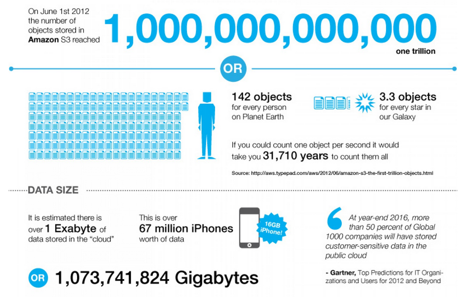
The other defining technological paradigm at that time was the ongoing migration to the cloud. By 2013, more than an exabyte of data—the equivalent of a billion gigabytes—was already stored in the cloud. More and more products and services were moving to the cloud, which had a powerful impact on app and product development at the time. The combination of these two factors created the ideal environment for Quip.
As profoundly as the shift to mobile computing and cloud-based storage had disrupted consumer technology, they had much less of an impact in the world of work–at least at first. Google was making headway with its Drive and Apps products, but Microsoft’s Office suite of products was still the dominant force in work-based productivity tools. By 2013, Microsoft Office had more than 1 billion users worldwide and had generated profits of almost $16 billion in 2012.
But as ubiquitous as Office was, the product itself was becoming bloated–a problem Microsoft had struggled with for years. Almost 20 years of feature creep had made Word, in particular, feel especially sluggish, and even the product’s newer tools were buried beneath confusing, increasingly crowded menu bars.
To Bret Taylor and Kevin Gibbs, cofounders of Quip, this was an incredible opportunity. Taylor and Gibbs didn’t want to just create a mobile word processor—they wanted to reimagine the concept of documents entirely.
By the time Bret Taylor and Kevin Gibbs founded Quip in 2013, both men had already built successful businesses within two of the largest technology companies in the world. Before cofounding Quip, Bret Taylor worked at Google, where he co-created Google Maps. He also served as Facebook’s CTO, and invented Facebook’s iconic “Like” button. Gibbs was also a seasoned tech veteran, having led engineering and product teams at Google, where he created Google App Engine and Google Suggest.
Taylor’s and Gibbs’s experience allowed them to critically evaluate the changing landscape of the productivity sector. The timing of Taylor and Gibbs’ venture couldn’t have been better. The shift to mobile and the growing ubiquity of cloud storage represented an unprecedented opportunity to redefine how we worked. Taylor and Gibbs could have settled for making a better word processor, but they identified a much greater opportunity: the chance to redefine what documents were and how we worked with them.
Taylor and Gibbs envisioned a lightweight, truly mobile app that looked and felt great to use. Its UI would be sleek and minimal, allowing users to focus on the content of a document rather than wrangling the document itself. It would be truly collaborative, allowing users to work seamlessly with one another across shared documents stored in the cloud in real time.
Put another way, Taylor and Gibbs wanted Quip to be fast, simple, and everywhere.
“The transition from PC to phones and tablets is so significant that all the software is going to change dramatically. There could be an opportunity for a company of our size to compete in this space for the first time in 30 years.” — Bret Taylor, Co-founder of Quip
When Quip launched in 2013, it was free for personal use. Initially, Quip was available on the iPhone, iPad, and even the iPod Touch. Quip also launched as an Android Preview Release at that time. The product was also available as a business version, which utilized a subscription model priced at $12 per month and allowed users to collaborate with more people. The earliest versions of Quip didn’t look entirely dissimilar to how Quip appears today. The left-hand side of the app was reserved for a comment and conversation window while the rest of the app’s real estate was devoted to document editing.
In terms of aesthetics, Quip shared little in common with Microsoft Word. There were no crowded menus to figure out, no arcane symbols to decode, and no contextual menus to navigate—there was just a blank document and a blinking, expectant cursor. Visually, Quip looked and felt more like Medium than a traditional word processor.
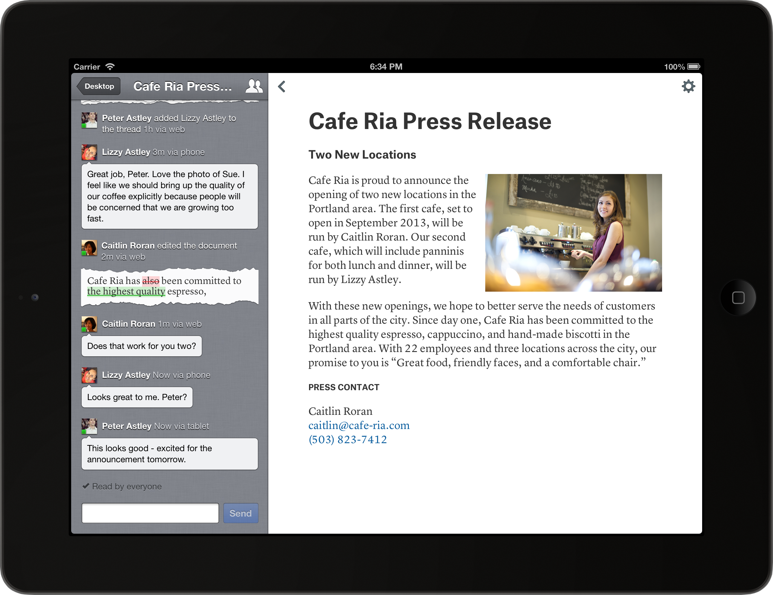
Despite its minimalistic UI, Quip did an excellent job of quickly giving users the information they needed. The conversation pane on the left-hand side of the screen summarized all activity within a document. The panel detailed who had viewed or edited a document since a user’s last session, as well as comments and highlights. Quip also showed users a quick visual overview of specific edits that had been made. Deletions were highlighted in red and struck through, while additions were highlighted in green, a convention Quip uses to this day.
What really set Quip apart was its conversation pane. Specifically, its real-time chat function. Unlike virtually every other product that tried to combine social functionality with utility, Quip’s collaborative communication features were perfectly integrated into the product. Users could ping their colleagues by using @mentions and respond to comments directly in the conversation pane. There was virtually zero friction when collaborating on documents. Something even the increasingly popular Google Docs couldn’t offer.
When Quip users were working in a document, they were also effectively in a chat room. No other productivity product before or since incorporated social features as effectively as Quip did, and this experience was crucial to Quip as a product. Quip’s chat functionality eliminated the need for back-and-forth emails because users could comment and highlight edits directly in the product. Quip’s chat and commenting features looked and felt seamless on mobile and appealed to the kinds of people Quip wanted to target: productivity enthusiasts who were looking for ways to get more done on the go. People didn’t want to be chained to their desks to get stuff done. They wanted to be productive using their mobile devices, use cases that no other productivity tool at that time supported.
In July 2013, Quip raised $15 million as part of its Series A round led by Benchmark Capital. At that time, Quip had 12 employees, all of whom worked out of the company’s headquarters, in San Francisco, California.
Although Quip used some of its Series A to fund ongoing product development, the company used a significant portion of the money to fund its expansion strategy—international localization. Almost immediately after launch, Quip was made available in French, German, Italian, Spanish, and simplified Chinese. Just over a month later, support for Japanese, Russian, Portuguese, and Turkish was introduced, bringing the total number of languages Quip supported to 10. This strategy was unorthodox, but it was also a smart play. Taylor and Gibbs knew that the experience of using Quip was the best way to demonstrate its potential value. Taylor had also experienced this kind of internationalization growth strategy firsthand during his tenure at Facebook, where it had proven incredibly effective.
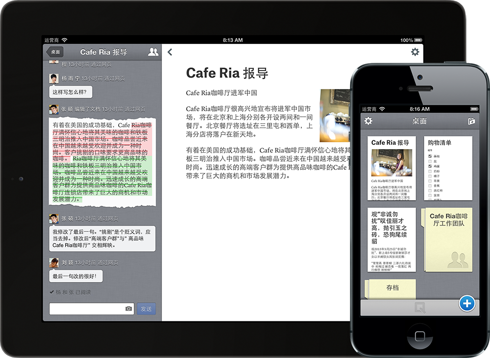
In December 2013, roughly six months after launch, Quip debuted its Android app. There wasn’t much to distinguish Quip for Android from Quip for iOS, but it was another necessary step in the company’s ambitious expansion plans. Making Quip available on Android devices radically expanded the product’s potential reach. Combined with its support for 11 languages (Quip added support for Korean when it released its Android app), the company was poised to expand rapidly in 2014.
Quip kicked off 2014 by introducing a range of product features designed to increase Quip’s utility in the workplace. Many of the features introduced in Quip 1.6 had been requested by users, including export to PDF functionality and an integration with Google Drive.
With every update, Quip became more and more useful. But Taylor and Gibbs weren’t just aiming to make collaborating with coworkers easier; they were responding to and solving problems that established products had failed to address. Microsoft Word may have been the dominant player in the productivity market, but it simply did not align with how people had begun to work. The advent of mobile meant that more people were spending more time connected to work than ever before, but most productivity tools available at that time were still walled gardens.
“In our testing, a lot of folks talked about how they now export everything into PDFs to send it out, because people can’t read Word documents on their phones. Previously, when everyone worked on PCs, that compatibility was the most important thing that the software had. Now, say you’re a lawyer and you’re on vacation, and your associate sends you a contract, and you can’t read it because you’re on your phone—that’s more of a problem.” — Bret Taylor, Co-founder of Quip
Q1 of 2014 also saw the introduction of a range of social features, beginning with the implementation of the Like button. Before he became Facebook’s CTO, Taylor had developed social bookmarking and real-time feed aggregator FriendFeed, where he and his team invented the Like button. When Facebook acquired FriendFeed in 2009 and introduced the Like button, it fundamentally reshaped Facebook as a social service.
Quip’s Like button wasn’t quite as transformative as it had been at Facebook. What made Quip’s Like button so important was the fact that it was a social feature that genuinely worked in a work-based product. From the beginning, Quip had set out to be a truly collaborative way for people to work together. This meant real-time interaction, an area in which every other productivity product at that time had failed. Quip’s Like button, and the conversation pane in general, looked and felt right. It was intuitive, and it just worked. Being able to “like” someone’s edit or update wasn’t merely a way to acknowledge that edit or update—it was a brief but genuine social interaction.
Over the coming months, Quip continued to introduce new features. April 2014 saw the release of the Quip API. The following month, Quip 2.0 was released. Quip 2.0 boasted several new features, including a robust search function with custom operands and the ability to export documents as Word documents. One of the smartest and most helpful features introduced in Quip 2.0 was the Publish function. This handy feature allowed users to share any Quip document as a read-only version with anyone, even if the recipient didn’t have Quip installed. This was an excellent way to showcase Quip’s potential without forcing people to install Quip beforehand.
By May 2014, more than 5,000 businesses worldwide were using Quip. Less than five months later, that figure would double to 10,000 businesses. Despite this remarkable growth, Quip’s sole focus until this point had been its word processing tool. But Taylor and Gibbs wanted to disrupt team-based collaboration as a concept, not just team-based text editing or word processing. Quip’s engineers had been working tirelessly behind the scenes to develop a spreadsheet product alongside the main Quip app, which launched officially in October 2014.
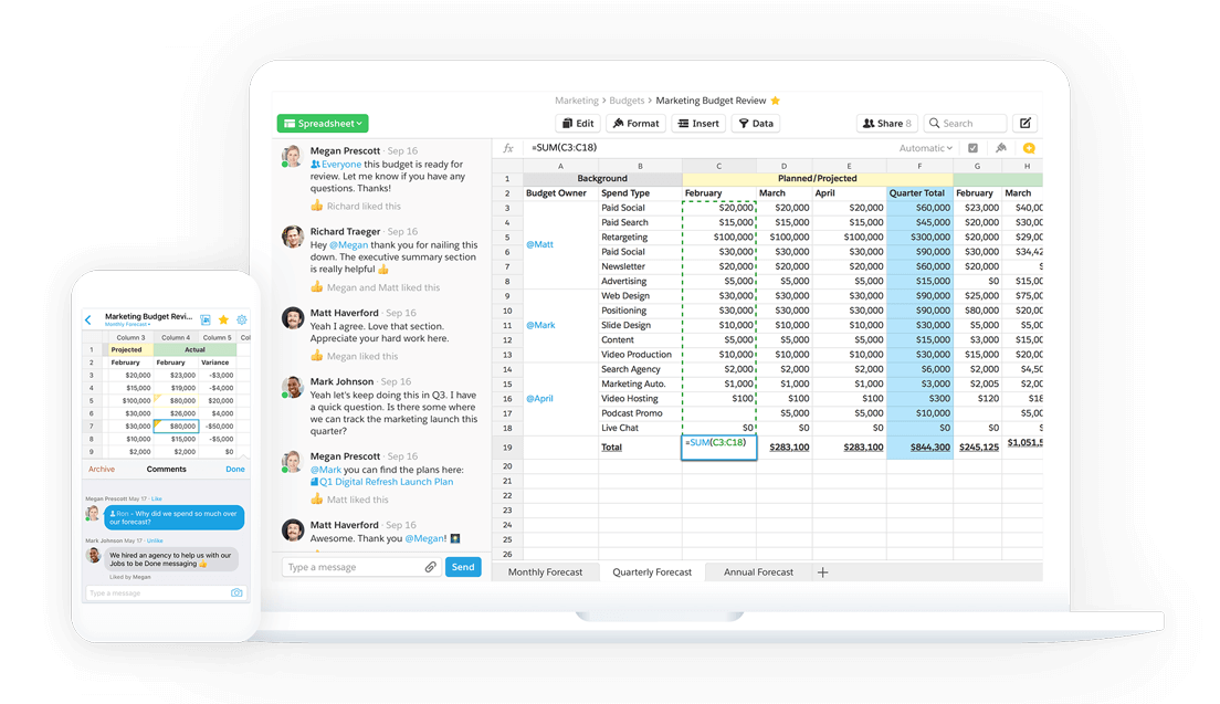
What made Quip’s spreadsheets unique is that they could be created from scratch in much the same way as text documents, but they could also be embedded within existing Quip documents. This made working between text and spreadsheet documents seamless.
Even better, changes made to embedded spreadsheets were updated and disseminated in real time across all instances of that database, which meant that only the original document needed to be updated. This was amazingly powerful. The fact that Quip’s spreadsheets were genuinely easy to use even on mobile devices was another major win for Quip.
In a little more than a year, Quip had launched in 11 languages on both iOS and Android platforms, allowing the company to expand aggressively very quickly. This expansion strategy, combined with the product’s genuinely useful and innovative social functionality, drove rapid growth. Quip gained ground quickly because it appealed to the changing ways in which people worked. Changes that would continue to shape Quip’s development as the company grew.
2015-2016: Creating a “Next-Generation Productivity Tool”
In a little more than a year, Quip had emerged not only as a scrappy upstart competitor to legacy incumbent products like Microsoft Office but also as a genuinely innovative collaboration platform. Quip had succeeded where every other productivity product had failed: It had successfully combined the utility of an office suite with the social functionality of a messaging client. Combined with its support for 11 languages and native apps for iOS and Android, Quip had quickly become a serious competitor in the productivity space—a position of strength that the company leveraged to great effect from 2015 to 2016.
Quip may have successfully combined work with chat, but it wasn’t without its competitors. Slack, specifically, had become incredibly popular. By early 2015, Slack was attracting upwards of 10,000 new users every week and was already valued at $1B. Although Slack and Quip were entirely different animals, Slack was quickly becoming the way for teams and colleagues to communicate at work. To combat Slack’s growing popularity, Quip introduced Chat Rooms in April 2015.
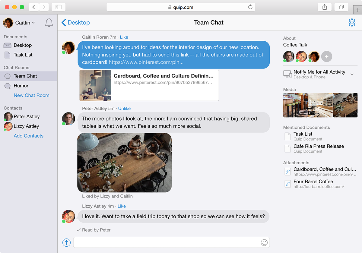
Chat rooms were essentially a miniature version of Slack that lived in Quip’s sidebar. Users could create and be invited to various chat rooms, each of which functioned exactly like a Slack channel.
Chat rooms might not have been as full featured as Slack, but they did make Quip even more effective as a team-based collaborative tool. People had been able to comment on and discuss documents since Quip launched. Chat rooms took the idea of team-based communication to the next level. Chat rooms gave people more room to talk in real time, which streamlined content creation in Quip even further.
People could now create documents on the fly, share those documents with colleagues, review and comment on initial feedback inline, and then jump into a chat room to discuss a project or document in greater depth—all without leaving Quip. It was a solid idea, but in light of Slack’s growing dominance, Quip ultimately opted to prioritize other features and implement a direct-message system that would replace chat rooms.
A few months later, in July 2015, Quip debuted its iOS and Windows desktop apps. Although this could have been perceived as a step backward for a mobile-first product, it was actually a smart move. The introduction of spreadsheets in Quip had resulted in a strong upturn in growth among business users.
When spreadsheets were introduced, just 10,000 businesses were using Quip. By the time Quip released its desktop apps, more than 30,000 businesses were using the product, including Facebook and Instagram, news networks Al Jazeera and CNN, online grocery-delivery company Instacart, and payments provider Stripe.
Quip’s desktop apps were up to 2.6X faster than Microsoft Word, making it a compelling alternative to Microsoft’s increasingly bloated flagship productivity product.
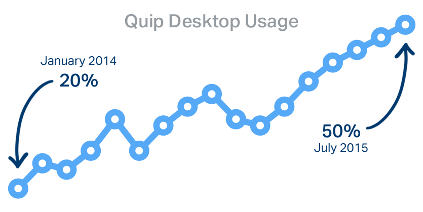
That was great news for Quip as a business, but it had also changed how people and teams were using Quip. According to Taylor, the ratio of daily mobile users to daily desktop users was roughly 80/20. By the time Quip’s desktop apps were introduced, that ratio had shifted to around 50/50.
Taylor and Gibbs wanted to combine the speed and reliability of a native application with the convenience and accessibility of a cloud-based service. As such, speed was a critical concern.
Like Spotify’s Daniel Ek, Taylor and Gibbs wanted Quip to feel as fast and responsive as a desktop application, with none of the drawbacks. Quip’s iOS and Windows apps weren’t just opportunistic ports of mobile tools—they were true hybrids that boasted the speed and stability of native applications with the ease, convenience, and accessibility of cloud-based services. There was no distinction between online and offline. Everything was just there, when and where you needed it.
“Your company’s knowledge shouldn’t be trapped in files. Whether they’re on someone’s hard drive or attached to someone’s email, files are not reliably accessible, searchable, or collaborative. With Quip, everything your team is working on is available on every device. And with Quip Desktop, you’ll experience none the traditional downsides of “the cloud”—no internet access required, no loading indicators, and unbelievable speed.” — Bret Taylor and Kevin Gibbs, Co-founders of Quip
By October 2015, Quip’s pricing had changed from $12 per month to between $10 and $25 per month, depending on the plan. Overall, growth had been so rapid—and lucrative—that the company had barely touched any of the $15M it raised as part of its Series A round in July 2013. That didn’t stop the company from raising an additional $30M as part of its Series B round, led by Greylock Partners and Benchmark Capital.
With the new funding came an influx of new managerial talent. The company poached New Relic’s former CMO Patrick Moran, who joined Quip as Chief Customer Officer. It also welcomed Greylock’s John Lilly to Quip’s board of directors.
For the next six months or so, Quip doubled down on its collaborative and social features. In March 2016, Quip introduced two important collaborative features, Show Edit History and Always Show Sidebar. From the beginning, Quip had used diffs—a way of comparing two different versions of the same document—to highlight changes, a convention that Taylor and Gibbs borrowed from version-control systems used by programmers. But as useful as diffs were, they weren’t as intuitive as a simple list of changes. Show Edit History aimed to make the editing process easier by showing individual edits as opposed to making users compare two versions of the same document. It might not have been the most noticeable change to the product, but it demonstrated Quip’s focus on improving the collaborative aspect of the product as Quip found its way into more and more businesses worldwide.
Alongside Quip’s new collaborative updates, March 2016 also saw the introduction of some new design elements: Horizontal Rules, and Pull and Block Quotes. Like Show Edit History, these minor cosmetic updates were a smaller step toward a greater goal. The product felt great to use, but it had to look great, too. Medium had almost singlehandedly made long-form writing cool again, and it had done so with its stylish, magazine editorial–style aesthetic. Quip’s new design elements took it one step away from a collaborative tool for ideation and rough drafting to a fully featured word processor with the formatting and styling options users were coming to expect from such tools.
Quip had been keeping a close eye on Slack since the real-time communication platform launched. The two products weren’t direct competitors, but as Quip’s Chat Rooms feature had demonstrated, Quip couldn’t afford to take its eyes off the increasingly popular workplace chat app, either. This is what made the announcement of Quip’s integration with Slack in May 2016 so clever.
As integrations go, Quip’s support for Slack was brilliant. Rather than fighting a losing battle by trying to build out similar functionality, Quip instead pursued deeper integrations with other products that Quip’s target market was using. The Slack integration seamlessly connected the two apps in all the right ways. Users could create new Quip documents directly from a Slack chat simply by using the operator/quip and giving their new document a title:
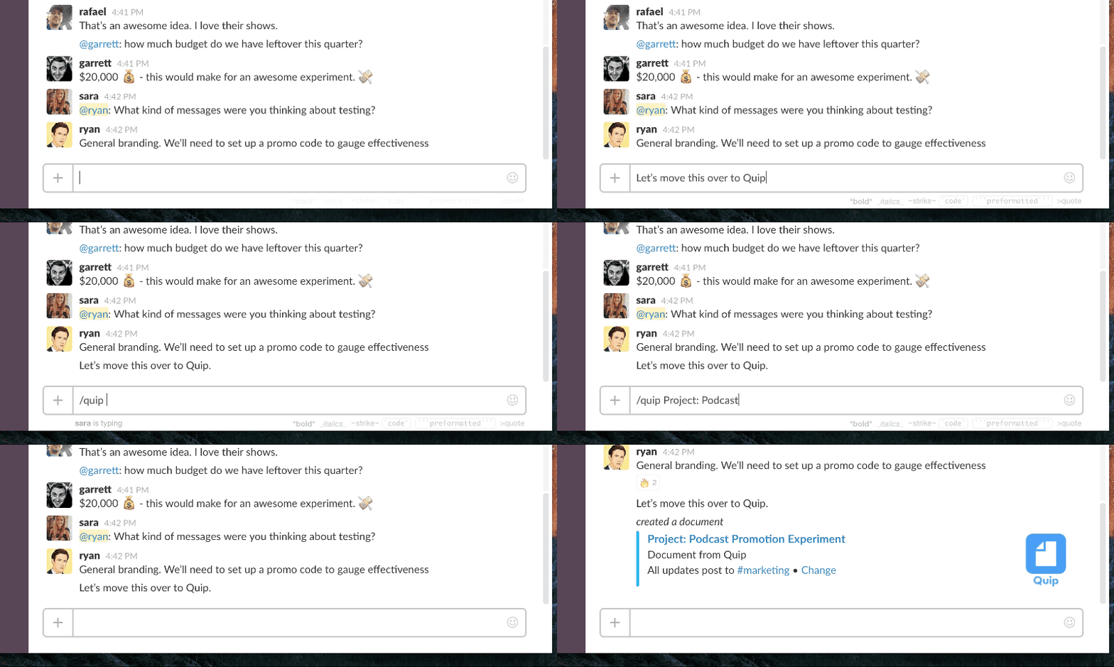
Quip’s social features were similarly accessible. Once a Quip document had been connected to Slack, every @mention, direct message, and status update made to a Quip document was posted to Slack automatically, and vice versa:
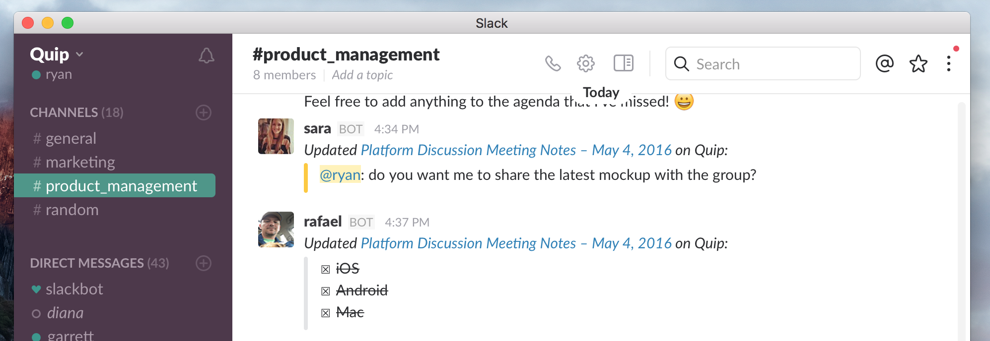
Perhaps best of all for workplace administrators, Quip’s Slack integration also preserved Slack permissions on a per-user basis. That meant administrators didn’t have to do any additional work to ensure that only the right people had access to the right documents in both Quip and Slack. That not only made make it easier for admins to implement (and more likely for them to do so in the first place) but also aligned strongly with Quip’s broader mission of empowering users to work in the ways they wanted to work.
By mid-2016, Quip’s focus was the same as every other productivity tool developer out there, dominate the enterprise. Google’s intentions for G Suite were crystal clear, and enterprise clients had been Microsoft’s bread and butter for more than 20 years. To make greater headway in the enterprise space, Quip hired Matt Cooley as the company’s chief revenue officer, a role Cooley had held at web analytics firm Mixpanel.
Cooley’s appointment to the CRO role was a smart move for a company with its eyes on the enterprise. But Quip announced in August 2016 that it was taking another approach to infiltrating the enterprise when it confirmed the company was being acquired by Salesforce for approximately $750 million.
Salesforce’s acquisition of Quip made sense on both sides. Salesforce got to bring one of the fastest-growing and most exciting productivity startups into the fold, which it could use alongside its other productivity tools to attract more enterprise clients. Quip gained access to Salesforce’s considerable resources and market penetration in the enterprise.
Despite the benefits, many analysts and members of the tech press were confused by the acquisition.
Quip certainly didn’t need to sell, and it could have easily remained independent. What made Quip such an attractive acquisition for Salesforce was Quip’s potential scope. There were dozens—if not hundreds—of highly specialized productivity tools already on the market.
Salesforce acquired Quip because it was the first genuinely mobile-first threat to the entire productivity suite, not just word processors. Taylor and Gibbs hadn’t created a better Word. They were creating a better Office. As the first major cloud-based SaaS company, Salesforce was ideally positioned to propel Quip to new heights of growth. Quip was also a smart tactical acquisition for Salesforce, which had begun to compete more aggressively with Microsoft in the wake of Salesforce’s failed bid to acquire LinkedIn.
Quip had grown incredibly quickly because other productivity tools available at that time simply weren’t able to cater to the changing ways in which people were working. Individuals and teams alike wanted a way to work together on the go—use cases that other products simply didn’t support. Taylor and Gibbs smartly recognized the need to support as many platforms and operating systems as they could, and the product’s steady growth was very attractive to Salesforce. In the coming years, Quip would leverage Salesforce’s considerable resources to prepare for its next major offensive: going after the rest of the traditional office productivity suite and the enterprise itself.
2017-Present: Live Apps and Expanding Across the Enterprise
Quip’s rapid expansion into overseas markets, strong revenue growth, and increasingly large user base put the company in an excellent position going into 2017. The company would spend much of 2017 improving the product further, adding new features and design elements. The most significant update to Quip would come later in the year, with the launch of Quip’s Live App store—a bold, ambitious move that had incredible potential.
Shortly after being acquired by Salesforce, Quip began 2017 by making an acquisition of its own when the company purchased software development studio Unity&Variety for an undisclosed sum. Unity&Variety’s best-known product was a mobile game known as Pinchworm. The studio had also been developing what Bret Taylor described as “a compelling productivity tool” behind closed doors.
In addition to Unity&Variety’s intellectual property, Quip also acquired the studio’s three-person team of cofounders Joey Flynn and Drew Hamlin, as well as the studio’s sole employee, Andy Chung. Prior to launching Unity&Variety, Flynn and Hamlin had worked on the amazingly successful redesign of Facebook Messenger in 2014. That experience of building successful social products was what Taylor and Gibbs really wanted, and it aligned perfectly with Quip’s culture.
It seems that after Pinchworm, Unity&Variety had focused its design prowess on a more utilitarian product that seemed promising to Quip. The team could give Quip the style it needs to keep attracting users to its ‘Microsoft Word for the mobile era.'” — Bret Taylor, Co-founder of Quip
The next few months saw a range of improvements made to the product. In February 2017, Quip once again received a visual makeover. The product’s conversation pane was redesigned to be sleeker and less intrusive. Notifications were introduced, as was the Projects feature, which allowed Quip users to assign time-sensitive tasks to certain team members.
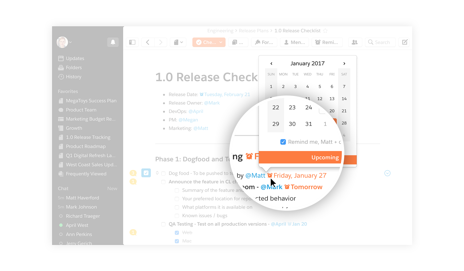
Reminders could now be added to any element within Quip: individual spreadsheet cells, project road maps, simple to-do lists, or entire documents. The product also introduced Quip Connect, an integration with Salesforce that built upon Quip’s live app functionality that allowed users to seamlessly connect Quip to their Salesforce CRM data.
Over the coming months, Quip continued to make improvements and tweaks to the product. After getting in on the April Fool’s Day festivities with a surprisingly convincing satirical blog post focusing on Quip’s imaginary “Print to 3D” feature, Quip introduced colored highlights in June 2017.
The biggest news of the year came in November 2017. First, Salesforce appointed Bret Taylor as Quip’s Chief Product Officer. Second, the company launched the Quip App Store.
Quip had been experimenting with live apps for some time prior to the launch of the Quip App Store. Quip spreadsheets could already be embedded in Quip text documents as live objects, in which changes to the source document were updated across all connected documents. Now, users could do the same with more data types, including calendars, Kanban boards, and Salesforce customer records.
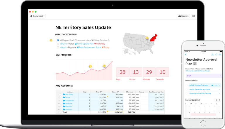
Alongside the launch of the Quip App Store, the company also announced its new Live App API. This allowed developers to create custom integrations beyond those offered out of the box, such as Quip’s initial third-party integrations with DocuSign, JIRA, and New Relic.
The release of the Live App API was arguably one of the most important steps in Quip’s growth as a company. Quip had experimented with live app functionality internally with its spreadsheets feature. After being acquired by Salesforce, Quip began exploring the potential of live apps as an ecosystem that could surround the core Quip product.
When Quip announced its App Store and API, the company’s intentions were crystal clear: Quip didn’t just want to replace Office as the world’s leading productivity suite—it wanted to become the nexus of cloud-based productivity as a whole, with Quip at the center of a sprawling third-party ecosystem of products and integrations.
The next several months were relatively quiet in terms of product development. The next major change to the product came in May 2018, when Quip removed all gender pronouns from the product. Initially, Quip did not allow users to specify their own gender and instead automatically guessed a user’s gender based solely on their first name. When a user took to Twitter to voice their displeasure about Quip incorrectly guessing their gender, Quip took notice and removed all gender pronouns from Quip’s UI.
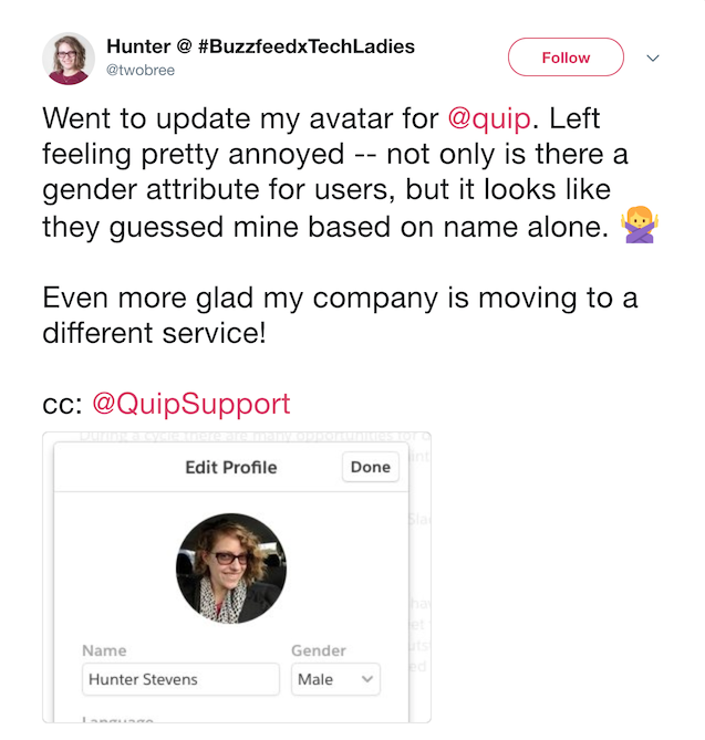
The removal of Quip’s gender pronouns certainly didn’t affect a majority of Quip’s user base. It did, however, demonstrate that even as a Salesforce company, Quip still valued feedback from its community and was willing to act upon it.
In June 2018, Quip announced the launch of the Quip Virtual Private Cloud (VPC). This was among the clearest indicators yet that Quip’s sights were set firmly on the enterprise and business clients. The Quip VPC was, for all intents and purposes, indistinguishable from the core Quip product—the only difference being the environment was a managed SaaS service that provided companies with greater control over how and where Quip was being used in their organizations.
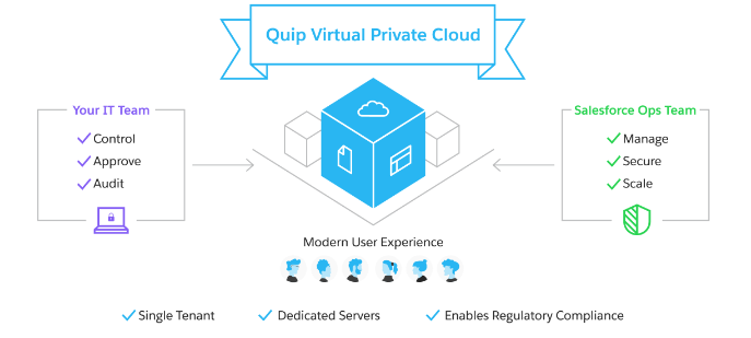
It was the perfect bridge between the heightened productivity and social, team-based collaboration promised by the core Quip product and a truly managed, bespoke back-end infrastructure solution that gave enterprise clients the control and compliance tools they needed. Quip VPC had been in development for around a year and a half prior to launch, by which time more than 100,000 employees at Fortune 100 companies were already using Quip VPC in their day-to-day work.
In September 2018, Quip once again gave the product a visual overhaul. The conversation pane was moved to the right, while the newly collapsible sidebar was revamped and tweaked to include a new Tasks drawer of items on users’ to-do lists. Quip also improved its search function to include Created By, Modified By, Date Opened, and Date Created search operands.
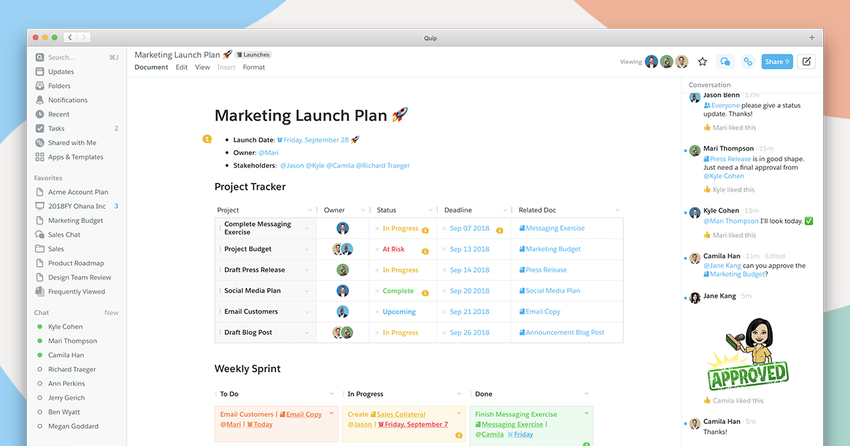
The biggest change to Quip in September 2018 wasn’t visual, however—it was the launch of Slides.
Quip had long had its eye on presentation software as the next frontier for the company to conquer. Having built a truly mobile word processor and improved upon the humble spreadsheet, it was inevitable that Quip would eventually release a presentation product. Like Quip’s other tools, Slides was a solid product, despite its minimal UI.
Aside from the usual functions you’d expect from a presentation tool, Slides also supported embedding of live apps from the Quip App Store and full integration with dynamic Salesforce records stored in live apps and documents. One of the most interesting elements of Slides was another innovative social feature that allowed users to see which presentation attendees had viewed which slides. Users could also see which individual slides had the highest engagement. That might not have been the highest-profile or most visible feature, but it was a great example of how Quip applied its institutional experience building deeply engaging social products to create genuinely innovative and helpful features.
Quip always felt like a truly mobile-first product. The company’s commitment to design helped the product feel fresh, light, and contemporary, even as they added more features and functionality that would help the product compete with entrenched incumbents such as Microsoft.
With every major update, Quip became faster, more collaborative, and integrated across an increasingly wide range of productivity tools. Thanks to the vision and entrepreneurial experience of its founders, Quip is uniquely positioned to redefine collaborative productivity tools in the coming years and make even greater gains in the enterprise.
Where Could Quip Go From Here?
In just a few years, Quip went from a scrappy upstart with grand ambitions to one of the most exciting and promising companies in the productivity space. Where could Quip go from here?
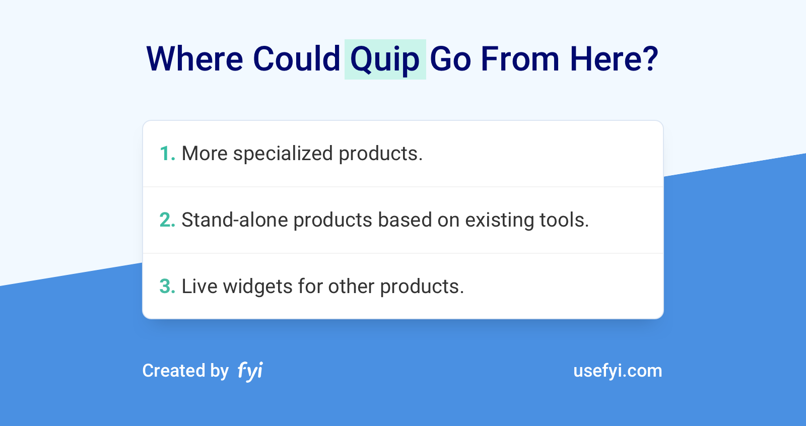
- More specialized products. Since becoming part of the Salesforce family of companies, Quip’s diverse utility has already been adapted to meet the needs of specialized professionals, such as sales reps, with products like Quip for Sales.
One likely move Quip could make in the near future is to develop and package other similarly specialized installations of Quip for professionals in other industries, such as finance. That would broaden Quip’s potential user base considerably and would also allow Salesforce to secure greater market share in crowded, intensely competitive verticals.
- Stand-alone products based on existing tools. Quip’s spreadsheet tool is remarkably powerful. However, at present it feels more like a nice add-on to Quip’s word processor than a product in its own right. Given the success of Airtable, one move Quip could make is to develop its spreadsheet tool into a fully featured stand-alone product that could compete with the likes of Airtable.
- Live widgets for other products. Although less likely than other potential directions the company might take, it’s not inconceivable that Quip could develop a range of Quip-branded live apps and widgets designed to integrate with competing products in the collaborative productivity space. Quip’s live apps have proved to be incredibly powerful, and the development of dedicated live widgets for other products could be a potentially lucrative revenue stream for Salesforce, especially if marketed and sold via the Quip App Store.
What Can We Learn From Quip?
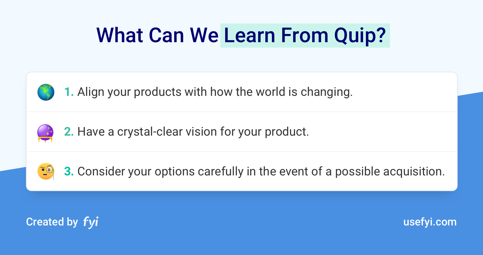
Quip not only targeted an immense opportunity in an even bigger market—it did so by nailing the timing and leveraging the expertise of its founders to develop a truly unique product the market urgently needed. What can we learn from Quip?
1. Align your products with how the world is changing. Taylor and Gibbs were able to predict how the technology sector was changing—e.g., moving away from individual productivity tools toward collaborative, team-based tools—and aligned Quip with those changes. This helped them launch the right product at the right time, targeted at the right market.
Take a look at your product and its place in your sector or vertical:
- How will broader shifts in technology affect your target market’s needs, positively or negatively? How can you align your product to leverage and take advantage of these shifts?
- Are there any opportunities you haven’t explored because you thought they were too ambitious? Quip wanted to effectively replace Microsoft Office—not exactly the easiest incumbent to beat. But Quip’s genuine innovation in combining work-based productivity with social functionality was brilliant, and an opportunity most companies overlooked or dismissed. How can you do the same with your product?
- Many founders spend too much time worrying about how their market is changing and completely ignore why their market is changing. Think about the last major shift in your industry. Why did this happen? Did you anticipate this shift, or did it take you by surprise?
2. Have a crystal-clear vision for your product. Timing was important to Quip’s success, but Taylor and Gibbs’s clearly defined vision of what Quip should be was the driving force behind the product. They knew exactly what they wanted Quip to be from the outset, which helped them stay focused on achieving ambitious goals—e.g., developing for multiple platforms in multiple languages very early on.
Think about your own product and be honest:
- Is your current product significantly different from the product you set out to build? If so, how and why did your product diverge from your original vision? Is your product better or stronger as a result?
- Taylor and Gibbs may have had an ambitious vision for Quip, but it was always tied to specific, tangible problems that were prevalent in almost every workplace—too many meetings, too many emails, too much time wasted. How closely does your product vision align with specific customer problems?
- There’s no shame in pivoting, and many wildly successful companies have done so—sometimes more than once. However, it is important to evaluate why a pivot was necessary. If you have pivoted from your initial idea, was your original vision too ambitious or too impractical? If you could go back in time, how would you approach your situation differently?
3. Consider your options carefully in the event of a possible acquisition. Quip was a smart, highly strategic acquisition for Salesforce, but Quip could have easily remained an independent, likely highly successful company. Salesforce’s considerable resources have likely made Quip’s mission to penetrate the enterprise a little easier, but they certainly didn’t have to sell.
If an acquisition is a viable or possible option for your company, answer the following:
- Which companies would be good, logical candidates as buyers for your product? Why?
- If you sold your company to, say, Salesforce or a similar company, how would your users benefit? Would you be able to preserve your company’s culture? How would taking care of your customers differ from your current approach to customer success?
- Many founders focus on what they hope to gain from an acquisition, and understandably so. But what would you stand to lose if your company were acquired by a much larger, wealthier organization? How much control or direct input would you be willing to sacrifice to close an acquisition offer?
Social, Work
Every product’s journey is affected by the experience and knowledge of its founders, but it’s hard to imagine what Quip might look like today—as a product or a company—if Taylor and Gibbs had launched their venture at a different point in their careers. Their expertise in building strongly engaging social products for two of the world’s largest technology companies was invaluable to Quip’s development and, ultimately, its success.
Few people can definitively say what Quip will do next. One thing’s for certain, though—Microsoft, Google, and pretty much every other company in the productivity space will be keeping a very close eye on what Quip does next.
Do you use Quip? You can find your Quip documents, alongside documents from other apps, in 3 clicks or less by using FYI.

