The 8 Best Email Signature You Should Copy
They say first impressions make or break you. But what about last impressions?
If you conduct business via email, you may already know how every single aspect – small and big – plays a crucial role in how your recipients perceive you.
And while your email copy should definitely be personalized and concise, you shouldn’t ignore adding the best email signature design to earn those major brownie points.
A good email signature should be simple, look professional, and include the right information. At the same time, though, no rule states you can’t be creative.
Below, we’ve compiled a list of the best email signatures that hit the sweet-spot combination of professional and interesting. We’ll also explain what works for every example and why you should consider copying it.
Let’s dig right in!
#1 The Simple and Concise Email Signature

Why it works: You may have heard how less is more. And when deciding your email signature format, in particular, this couldn’t have been more fitting. With its straightforward design, Chanelle’s email signature contains all her necessary contact information – her address, mobile number, email, and website. So not only does it look simple, but also contains all the significant details.
Plus, if your email signature looks too busy or contains way too much information, it’ll defeat the whole purpose of making a (good) impact on your recipient. Our example illustrates this perfectly.
Chanelle‘s photo is small and doesn’t distract her reader away from her contact details, which is exactly what she wants – for them to contact her on any one of her listed choices.
You can consider adding the following details to your signature to keep it detailed yet short:
- Your first and last name
- Your affiliation info like job title, your company or organization, and department.
- Your primary and secondary contact information like phone number, email, and other lines where it would be best for people to reach you
- Your social profile icons
Overall, your email signature should look simple and minimalist – instead of busy and overwhelming.
Make this your golden rule for all your future e-signatures.
#2 The Email Signature With Social Media Icons

Why it works: David has chosen a dark red color to highlight his social media profiles, which works really well with the white background. Plus, he’s only included relevant social media profiles instead of adding links to every single platform he’s on.
Social media has tremendous importance in today’s time. So it makes perfect sense to include your social profiles in your email signature.
Not only will this help you drive traffic to your respective social media platforms, but even your recipients get a better idea about your qualifications, company, and designation, among other things. What makes it even better is you can reinforce your personal brand when sending out emails to prospective customers.
Also, it’s better to use social media icons instead of text links.
Firstly, icons are easily recognizable which comes in handy when the recipient skims through your signature. And secondly, using bright-colored icons increases a person‘s willingness to read the rest of the content by 80%. No joke.
You should certainly add social media profiles to your e-signs, but avoid going overboard. Stick to only 5 to 6 profile icons, and in case you feel like adding more… please don’t.
#3 The Email Signature With *One* Call-to-Action or CTA
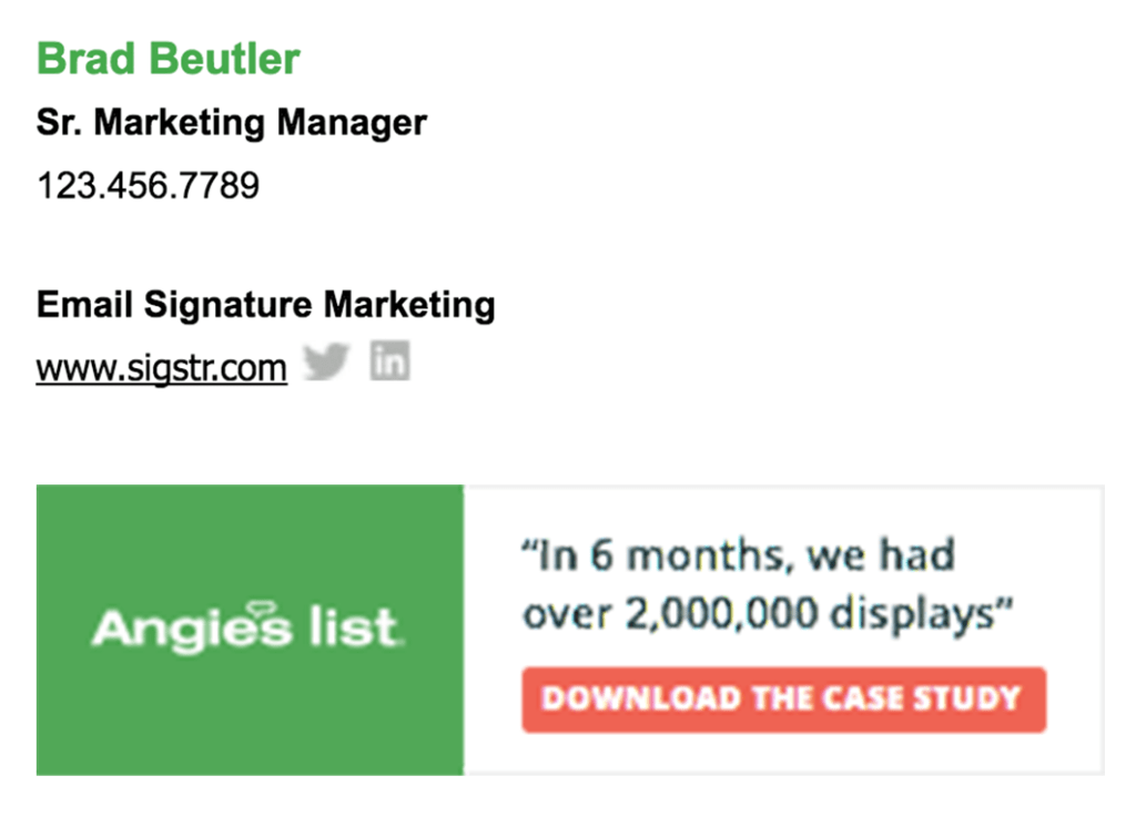
Why it works: This email signature has the two points we mentioned before – a simple design and relevant social media profiles. But it also has a very prominent CTA, which is what takes it to the next level. We really cannot emphasize the importance of CTAs enough, really. Just take a look at the best business email signature examples, and you’ll find most will feature clear and simple CTAs.
The CTA in Brad’s signature is very noticeable and makes use of striking colors like red and green that instantly draws the attention of the recipient to it. This can be very useful for increasing click-through rates.
Here are a few examples that you can include in your email signature:
- A link to your calendar
- Links to your review sites
- Downloadable links to case studies, PDFs, or reports
- Links to your website or marketplace
- Links to your social media profiles
That said, we would also recommend running A/B tests to determine which CTA works best with your target audience. Your CTAs shouldn’t be too pushy as well.
#4 The Mobile-Optimized Email Signature

Why it works: This email signature template may look very simple at first, with nothing too special about it. However, since it’s optimized for mobile devices, it’s more effective than fancy, unoptimized designs.
You see, mobile phones have become an indispensable part of our lives, and checking our emails just happens to be one of the several tasks that we use our cell phones for.
Experts found that more than 70% of people read their emails on their mobiles, which is why optimizing your emails and email signatures for mobile phones is so important today. What’s more, mobile users tend to check their emails 3x more than non-mobile users!
The best ways to make your email signature mobile friendly is to keep the design digestible and clickable for mobile users. Precisely why you should scale your signature carefully.
It’s not that difficult too!
Make sure your text is easily readable on the small screen of mobile devices, the links and buttons are well-spaced out and large enough to be tapped at by the recipient, and that the design looks balanced on the whole.
#5 The Color-Coordinated Email Signature

Why this works: The splash of color on this email signature is fun and creative, working wonders to spruce up an otherwise black and white email. The colorful social media profiles have been given a 3-D effect, while the company’s name sits proudly at the very top. It catches the eye instantly!
Many think that making something look professional means sticking to monochrome or muted down pastels when that really isn’t the case. You can always play with some color, but you need to be intelligent about it.
For instance, instead of making the whole background of your email signature multicolor, only add hints of color to your social media icons, contact information, or your name.
Another great tip when finalizing your color palette is to see how well they complement your brand logo. In our example, Jane‘s SGL logo is red, which is why the color is more emphasized in the overall design.
If you don’t want to be too experimental, you can always stick to a smaller color scheme that is soothing to the eyes – something like Chaya’s email signature.

Instead of making it colorful like Jane, Chaya has chosen a black font that is highlighted by a new one blue color, which is run over her social media links. This flash of color to an otherwise monochromatic design is exactly what you need to make your links eye-catching and clickable.
#6 The Email Signature With Visual Gradation

Why this works: When you see real-life Tony Stark, Elon Musk, using an email signature tactic, you just know that it’s something that you should implement too.
Here, Elon has highlighted his name (he’s brand himself, after all) and his position as the CEO of Tesla. This is followed by Tesla‘s website, his email address, and a slightly bigger office address. The social media profile icons have been purposely designed in a way that they don’t draw attention away from Elon‘s name.
Implementing visual radiation involves highlighting all the essential parts of your email footer, such as your title, phone number, website, and so on. Here are a few tips that you can use:
Prioritize Your Information
Create a visual hierarchy of information based on what you think is important for directing readers’ attention. You should organize and prioritize content and images that make it easy to read and striking.
Plus, the visual hierarchy is like a pyramid – where the most critical elements will be at the top in a larger font and will be followed by other details in a correspondingly smaller font.
Here’s a good rule of thumb that you can follow:
Name > Title > Address > Phone number > Email > Website > Social media profile icons
Remember, the information you place at the top of your visual hierarchy will be the first thing that your recipient will process.
Use Bold Letters Whenever Possible
You can bold letters on parts of your signature that you feel are the most important. This will help you draw your reader’s attention quickly.
Play With Your Font Size
You have lots of flexibility when it comes to fonts while designing your email footer. You can have a font size of 12 to highlight your name, awards, certificates, and so on, while the font size can be 10 for your address and contact information.
We would recommend sticking to a font size between 10 and 12, though, as it ensures the best readability.
#7 The Graphic Email Signature

Why it works: Julie has chosen a very friendly picture of herself – one that complements the green cuboid of Torp Co. Also, her image, along with other small graphics, is high-quality, which makes everything look more appealing.
Contrarily, imagine if Julie would’ve used a blurry, pixelated, or low-quality image. Wouldn’t her signature look shabby. Exactly.
The following are a few tips to help you choose the right image and graphic elements for your email signature:
- Always opt for a headshot instead of a full-body photo.
- Choose photographs with a neutral background or one that doesn’t look too busy (Julie has a non-distracting green foliage background).
- Make sure your graphics have the proper resolution and have a simple, clean design.
Certain internet service providers (ISPs) like Outlook use the DPI value of images to scale the image. It has a default 96 DPI or 100% zoom setting for all its images.
Similarly, you should find out the scaling requirements of your ISP or ESP to avoid ending up with fuzzy, blurry, or pixelated email signatures.
#8 The Personalized Email Signature

Why it works: Stephanie chose to end her email with a handwritten sign-off that adds a personalized touch to her email. It gives it that absent human touch, which can help her boost her clickthrough and reply rates.
You see, adding a personalized touch – be it handwritten signatures, live animation, and other visual touches – makes the reader feel more connected to your email. If you choose to add a handwritten sign off to your emails, make sure you choose an easily readable and thick font, and don’t forget to mobile optimize it too!
Wrapping Up
Your email signature is much more than a communication device – it can help you develop client relationships and aid your marketing and sales efforts.
Once you finish creating your professional email signature, make sure you keep it updated and relevant. All your links, phone numbers, and other information should be current. Keep your email signature simple and easy to digest.
And yes, don’t forget to have fun!