The Ultimate Manual For Data Discovery
The twenty-first century is the age of data, with technology generating data at an unprecedented pace and rate. The average business collects abundant information, including supplier lead times, customer buying patterns, and marketing efforts. Data discovery addresses the issue of putting all this information to good use.
What Is Data Discovery Anyway?
Data discovery is the process of collecting data from different sources and consolidating it on a single platform to discover patterns.
Visual analysis, such as graphs and charts, is a big part of this process. The compiled data is presented visually, making it possible to identify trends, patterns, and inconsistencies in the data at a glance.
Data discovery is more of a process rather than a tool. This process aims to help users make informed business decisions using interactive and digestible visual data.
How Data Discovery Works
The data discovery process has three core principles. These principles are data preparation, data visualization, and guided advanced analytics. An overview of the data discovery core principles will help us understand how data discovery works in a nutshell.
Data Preparation
Using error-ridden raw data leads to inaccurate, inconsistent, and misleading insights in the data analysis stage. This reality makes data preparation a key pillar in data discovery.
This process first entails collecting data from different sources and consolidating it in a single location. This step is also crucial for transforming different data structures into one consistent format.
Data preparation isn’t complete without pre-processing the data for analytics. This step involves identifying duplicate data, filling incomplete data, correcting data errors, and cleaning up the data to make it as accurate as possible.
But before you jump right into cleaning the data, there is a preliminary step worth including in the process. Data profiling, or identifying data sources, could save you time and improve accuracy.
Not all data sources are worth looking into in the first place. Disqualifying data sources from the beginning can help to cut out a lot of the noise when cleaning data. You can also identify data types not worth collecting and storing going forward. You’d be surprised at how much you can save in data storage y discarding non-essential data.
Data Visualization
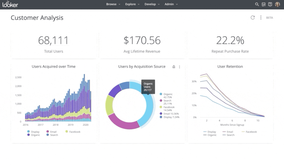
A key hallmark of data discovery is visualization. Tools such as heat maps, charts, graphs, and scatter plots make it possible to identify patterns in data visually. In part, data visualization relies on the brain’s innate ability to detect patterns and anomalies.
Data visualization has also made it possible for laypeople to gain insights from data that would otherwise require teams of data scientists and other professionals.
The key to successful data visualization is simplicity. This is a technique that marketers tend to do exceptionally well. Simple graphs, tables, or heat maps displaying only relevant information help to optimize your data visualization.
While at it, data discovery tools offer different types of dashboards for data visualization. It helps to match the dashboard to the specific use cases. For example:
Strategic dashboards are mainly designed with comprehensive analysis in mind. This analysis may include KPI metrics, such as the last quarter’s profits. Essentially, strategic dashboards provide information directly. Based on their design, strategic dashboards work best for presenting information to department heads and C-Suite executives.
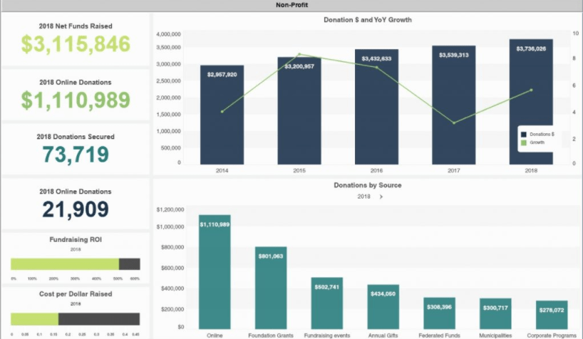
Analytical dashboards, on the other hand, are more interactive. These dashboards allow users to experiment and research data quickly. Tech teams and developers tend to prefer these kinds of dashboards.
Advanced Analytics
Analyzing data is a time-consuming process. However, the results are often worth it. Successful data analysis starts with a specific problem you are trying to solve using data. This approach helps to avoid wandering aimlessly while exploring data.
Additionally, analytics isn’t a stand-alone process. There needs to be communication with other departments, including HR, finance, marketing, and operations. These departments typically have information on the ground and can retrieve valuable insights from advanced analytics.
Advanced business intelligence tools help to identify even more insights from large volumes of data. For example, predictive analytics can simulate future conditions, giving you valuable insights into what might happen in the future.
Finally, the only way to yield impact from advanced analytics is to act on the insights.
Here are three examples of data discovery in action.
Example 1: Walmart
Walmart is a perfect example of how big brands leverage data discovery to drive business. Data discovery is a core part of Walmart’s strategy and has helped optimize, enhance, and customize the shopping experience.
For example, Walmart utilizes simulations at its pharmacies to identify the busiest times of the day or month and find out how many prescriptions are filled each day. This information helps the retailer optimize prescription filling time and staff scheduling.
Additionally, Walmart uses predictive analytics to anticipate demand during specific business hours. The insights from this data help the chain figure out the number of associates required at the counters and the best checkout option for each store.
Finally, Walmart continually analyzes customer shopping patterns and preferences. This data helps inform the chain on how to display merchandise and stock shelves. Also, the collected information, once analyzed, helps to gain insights on which private brands to carry, discontinued products, and new items.
Example 2: Coca-Cola
Another example of successful data discovery is Coca-Cola. This brand implemented artificial intelligence in its data discovery framework and continues to reap results.
The most significant gains for Coca-Cola’s strategy are arguably in product development. For example, the 2017 launch of Cherry Sprite wasn’t just a stab in the dark. The brand revealed that the concept for the drink came directly from data gathered from the company’s self-service drink fountains.
By analyzing nearly infinite flavor combinations, Coca-Cola was able to zero in on the most popular flavor combination and transform it into a ready drink for the mass market.
Example 3: Santam Insurance
Santam Insurance, a South African financial services company, knows the benefits of predictive analytics, a branch of data discovery, all too well.
By implementing IBM SPSS software, the company detected a fraud ring within the first month of implementation. Santam was also able to save the equivalent of 30 external assessors and accelerate 50% of processing claims.
Santam estimated that it was losing up to 10% of premium revenue to fraud leading up to the adoption of predictive analytics. The positive net results of company-wide adoption include:
- Reduced need for remote agents
- Reduced the time it takes to investigate each case
- Improved fraud detection capability
How to Get Started With Data Discovery
Data discovery isn’t just a purview of big-tech anymore. Businesses and organizations of any size can maximize their database return on investment. Below are the steps to get you on the path to successful data discovery.
Step 1: Identify your pain points
Collating data into a visual representation for its own sake defeats the purpose of taking on such a significant project as data discovery. Clarity of purpose, or why you want to perform data discovery in the first place, helps to guide the general direction of this process.
A great way to build this clarity is to think about the pain points you are trying to solve with data discovery. Some of the usual challenges include:
- Slow or limited access to large sets of information within and across the organization
- Difficulty gathering and understanding data from various sources
- More time spent organizing, understanding, and reporting data than the time spent using the data to improve processes and drive innovation
This step also helps to set the scope of the project. Work with key members, including departmental heads, to identify pain points.
Step 2: Blend various data sources
Connect the various data sources, including structured and unstructured data, in a single data warehouse. Data integration tools can help you collect and combine the different datasets from the various sources in one location. With this tool, you can integrate divergent data sources using standardized data formats.
Be sure to include dark or unstructured data such as paper-based documents, videos, and photos in this process. Dark data refers to the information in your data centers that is never used. This is also an excellent time to identify which dark data needs to be discarded.
Data processing has traditionally been left to analysts and scientists. There are many self-service data preparation tools on the market. These tools allow people without advanced IT skills to process data simply and quickly.
These tools retrieve data from multiple datasets, including data lakes, data warehouses, CSV files, Excel, and cloud apps.
Step 3: Clean up and prepare the data
Included in the mounds of data you collected in the previous step is corrupted, distorted, and inaccurate data. Cleaning up the data involves identifying, correcting, and removing inaccurate data. Additionally, it is necessary to remove duplicate or incomplete data.
Explicit criteria for what constitutes quality data help to streamline the process. Make a list of data quality key performance indicators (KPI) to adhere to during this process. Examples of data quality KPIs may include the amount of dark data, the ratio of data to errors, and the number of empty values.
Keep an eye out for where most of the data quality errors occur. You can then use this information to establish systems that guarantee healthy data on an ongoing basis.
The goal here is to end up with valid, complete, consistent, and uniform data. This is also the perfect time to implement standard procedures at the point of entry. This means ensuring that all data coming into the organization conforms to your set-out corporate standards and comes from a vetted source.
Fortunately, you can rely on data cleaning and automation tools to help you with this step.
Step 4: Analyze the data to generate insights
With a single distributed version of your data, it becomes easy to generate actionable insights. For this, analytical tools such as descriptive, predictive, diagnostic, or prescriptive analysis can help you glean valuable insights from your data.
Be sure to match your analytical tool to your industry and data discovery objectives. For example, descriptive analysis tools help you discover what happened, such as your KPIs. Diagnostic tools, on the other hand, help you find out why something happened. An example is what’s causing slow shipments in a specific region.
Also, don’t forget to adhere to security and governance protocols. It’s easy to get the analysis thrown out simply because you did not adhere to relevant laws and guidelines during data analysis.
Finally, choose an all-in-one tool for the entire data discovery process. Using separate tools for each step of the discovery process is cumbersome and expensive.
Step 5: Visualize the insights
Create visual representations of the insights that you gather from your data. Visual aids such as heat maps, graphs, scatter plots, and charts make it easier to understand and interpret critical insights and metrics.
Choosing the correct visualization tool for your purposes can help you get the most insight from your data. For example:
Tables – These consist of rows and columns and are perfect for highlighting high-level trends. Tables display plenty of information in a structured format without overwhelming users.
Bar charts – If you need to compare quantities in different categories, bar charts are the way to go.
Line charts – This is a good choice for tracking trends or changes over time. Line charts are also great for monitoring the relationship between two or more variables.
Scatter plots – Here, two variables are plotted along two axes, along with their values. The resulting points produce a pattern revealing the correlation between the variables.
Pie charts – While they can sometimes be tricky to use, pie charts are great for showing how parts of a whole compare. Just make sure that the sizes of the different parts of the diagram correspond to the values they represent. For example, the section showing 33% should be obviously larger than the piece showing 23%.
Heat maps – These are perfect for representing geographical data.
Finally, choose an all-in-one discovery tool that competently handles each of these steps. Some tools are excellent for visualization but can’t handle large datasets or pull data from various sources. Any holes in your tool’s capability only put unnecessary pressure on your IT staff.