The 32 Best Chrome Themes for 2020
Out of the box, the standard Chrome theme looks a bit flat.
Whatever your taste, there’s a perfect theme for you.
We’ve rounded up 32 of the best Chrome themes. They’re arranged by type to make it easier to find want you want:
- Dark themes
- Space themes
- Minimal themes
- Nature themes
- Abstract and atmospheric themes
- Artistic themes
- Comics, games, TV, and movie-related themes
Dark themes
Looking for a theme to match Chrome’s new Dark Mode? Or just something that’s easy on the eyes for late night working? We’ve hand-picked the best dark themes in the Chrome Store.
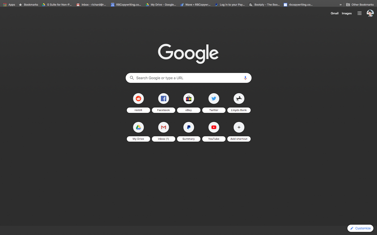
1. Dark Theme V3
- By: www.mxdelacruz.com
- Best for: Simple dark mode.
- Users: 400,000+
- Rating: 4.2/5
Optimized for 4k resolution, this is a basic, minimal dark theme for Chrome. Note that it doesn’t affect website content. All the navigation controls are easily visible.
2. Abstract Blue
- By: http://theepupil.com
- Best for: An aesthetic look.
- Users: 80,000+
- Rating: 4.7/5
Here’s a more elegant dark theme based on abstract blue shapes resembling smoke swirls. It’s easy on the eye and has visible controls, but with branding visible in the bottom left corner, which some users might find obtrusive.
3. Morpheon Dark
- By: morpheondark.com
- Best for: Stark and dark.
- Users: 1,000,000+
- Rating: 4.4/5
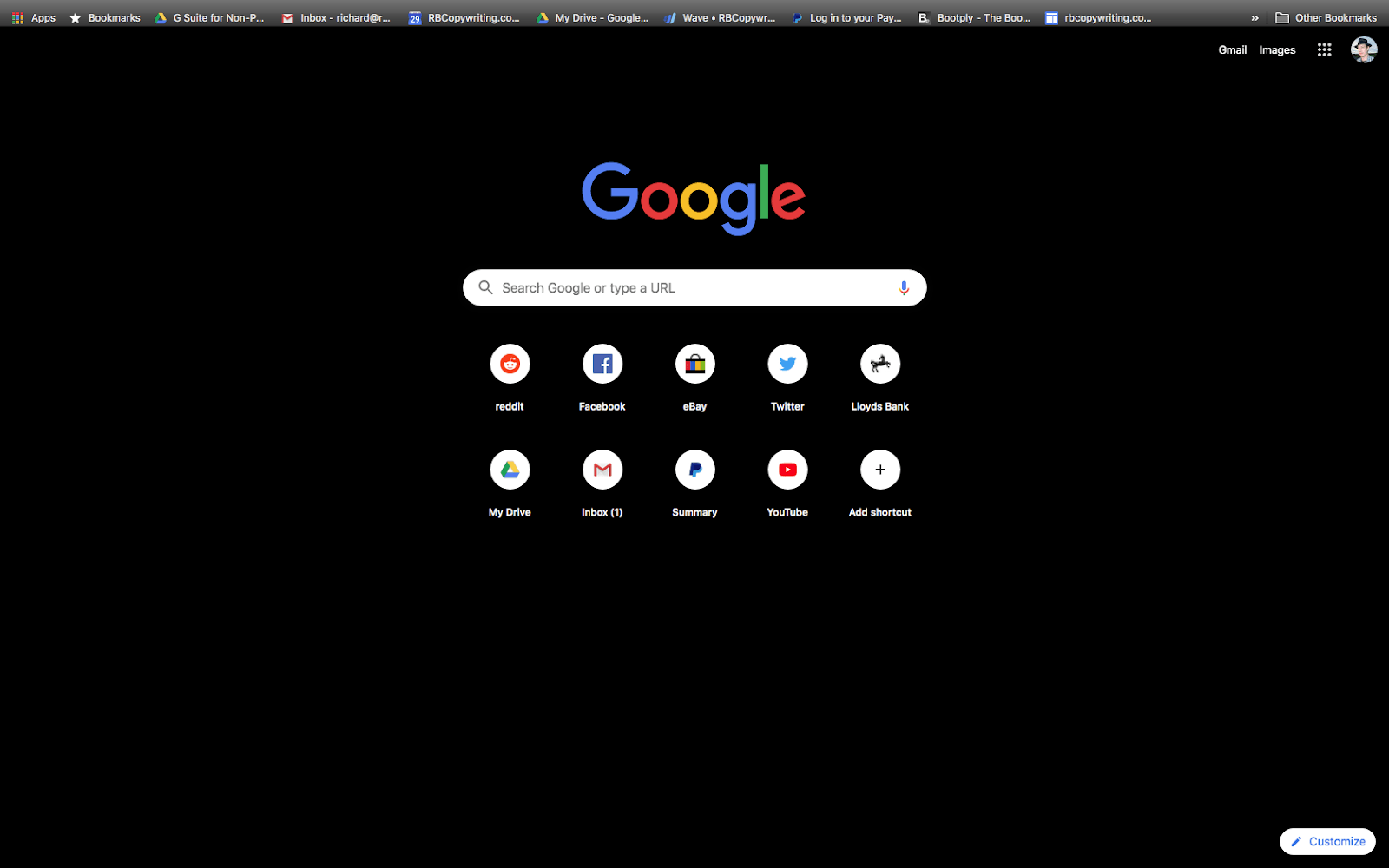
Morpheon Dark is a high-contrast black and white dark theme, minimal and easy to navigate. If you use dark mode for its contrast and clarity, this theme will fit your preferences.
4. Material Dark
- By: Stanley Lim
- Best for: Late-night working.
- Users: 400,000+
- Rating: 4.6/5
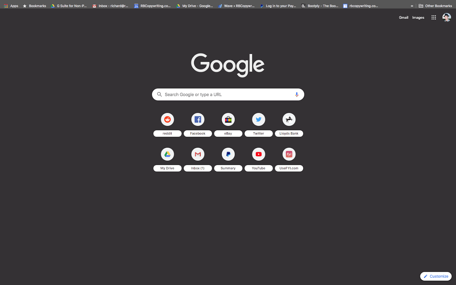
This one is less intense. Tabs don’t change color when you mouse over them. The selected tab is colored pale gray, making it easy to find.
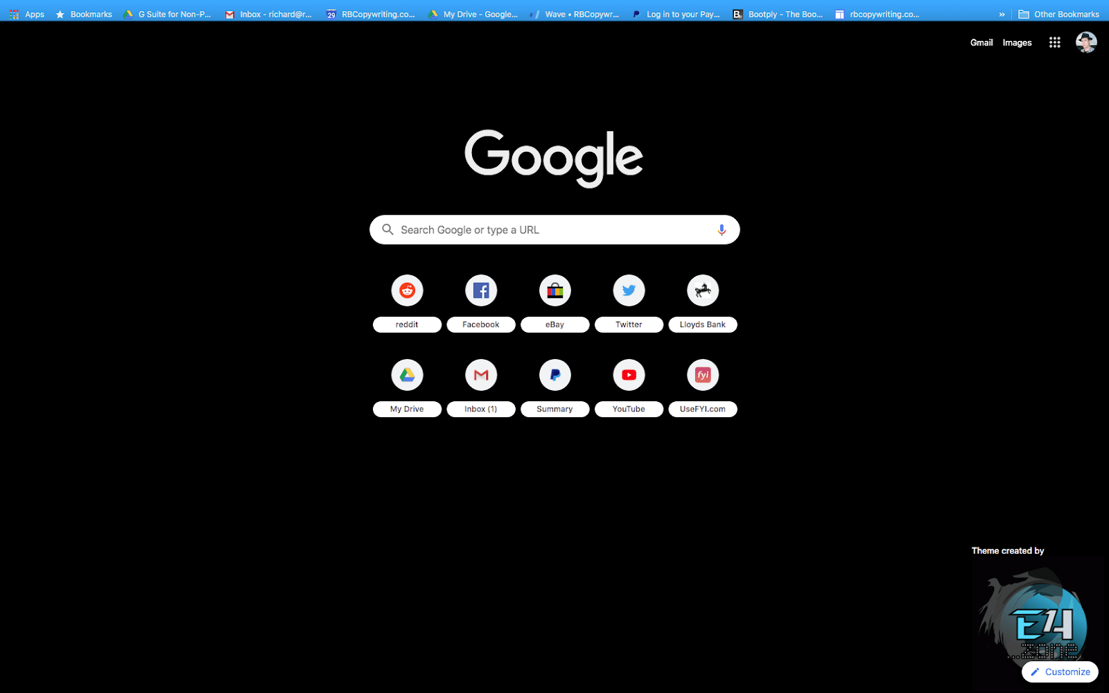
5. E4 Dark
- By: www.nixsur.com
- Best for: Bold and dark.
- Users: 1,000+
- Rating: 4.7/5
A simple dark theme with bold highlights, E4 Dark uses translucent blue to indicate the tab you’re mousing over, with a stronger blue for the selected tab. There’s a large visible logo that some might find distracting.
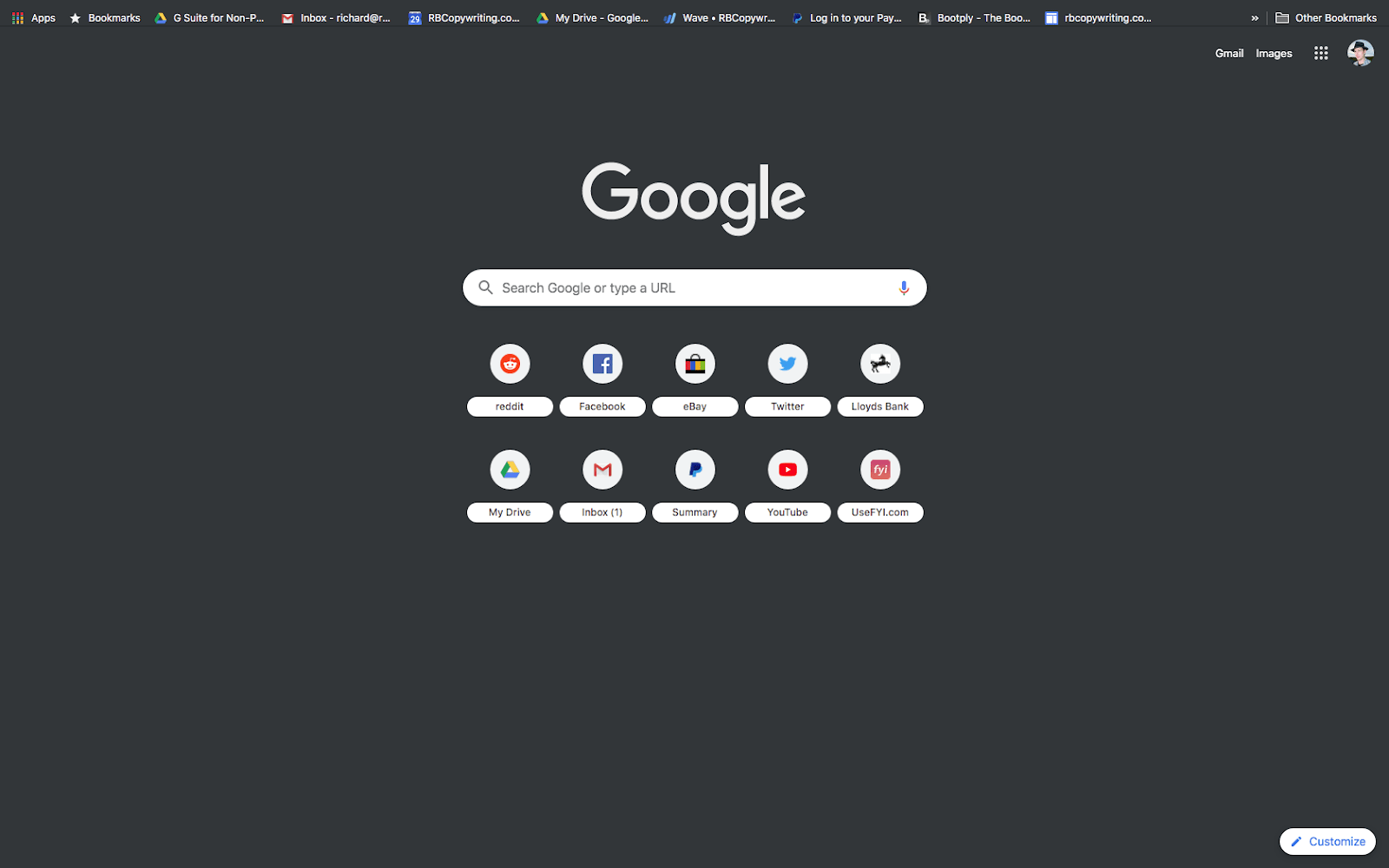
6. Material Incognito Dark
- By: Fiddle N
- Best for: Mimicking Incognito mode.
- Users: 500,000+
- Rating: 4.7/5
This is designed to closely mimic Chrome’s Incognito mode, so if that’s your favorite Chrome look, this is the theme for you. Moused and selected tabs are the same color. This is a true minimal theme with no visible branding.
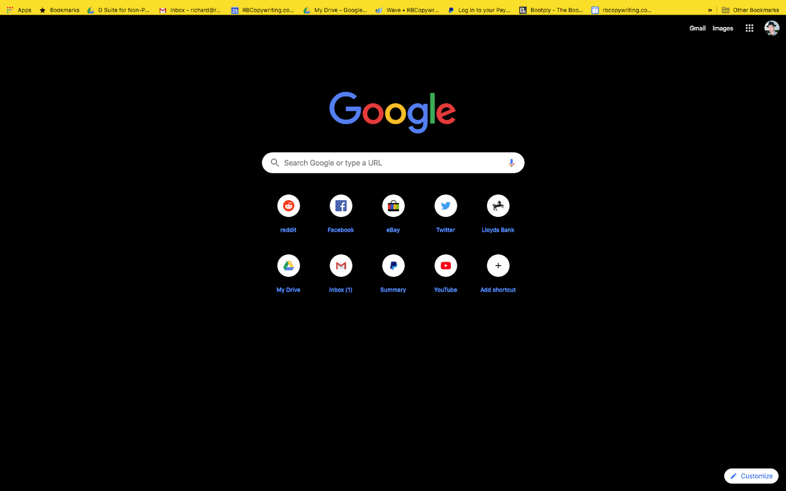
7. High Contrast Colorful
- By: The Chrome team
- Best for: Dark with a pop!
- Users: 300,000+
- Rating: 4.4/5
This high-contrast theme is black with bright colors in the control areas. It’s a little tougher on the eyes than a more muted dark theme, but it’s easy to use.
Space themes
Who doesn’t love a good space theme? Often dark, but with a sense of atmosphere and infinite depth, these are just what you need to give your new tab some perspective.
8. Earth in Space
- By: Atavi.com
- Best for: An extraterrestrial view.
- Users: 300,000+
- Rating: 3.8/5
This theme depicts an atmospheric view of the earth from space, with dark blue and black theme elements.
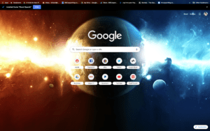
9. Planet Spaceix
- By: Spaceix
- Best for: Dramatic effect.
- Users: 10,000+
- Rating: 4.4/5
This dynamic space theme features theme graphics in the tab and bookmark bars without impeding visibility.
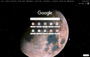
10. Real Moon
- By: chrisjaka
- Best for: Atmospheric accuracy.
- Users: 10,000+
- Rating: 4.6/5
With a real telephoto shot of the earth’s moon, this Chrome theme is a good fit for space enthusiasts who prefer their astronomy with less jetpack mixed in. The stars in the background of the main image persist into the control areas and remain visible in tabs.
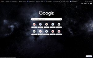
11. Dark Space
- By: Hyp3r10n
- Best for: Dark theme that’s space-y without being intrusive.
- Users: 200,000+
- Rating: 4.6/5
Dark Space is a space theme that’s understated, minimal, and very dark. The theme visuals continue uninterrupted into the control area, but the theme’s so dark that it doesn’t matter.
Minimal themes
They’re hardly there. We picked the best two.
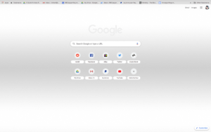
12. Minimal
- By: Seth Corker
- Best for: Clean simplicity.
- Users: 20,000+
- Rating: 4.6/5
Minimal isn’t kidding: this is a hardly-there theme that’s even less intrusive than the baseline Chrome theme.
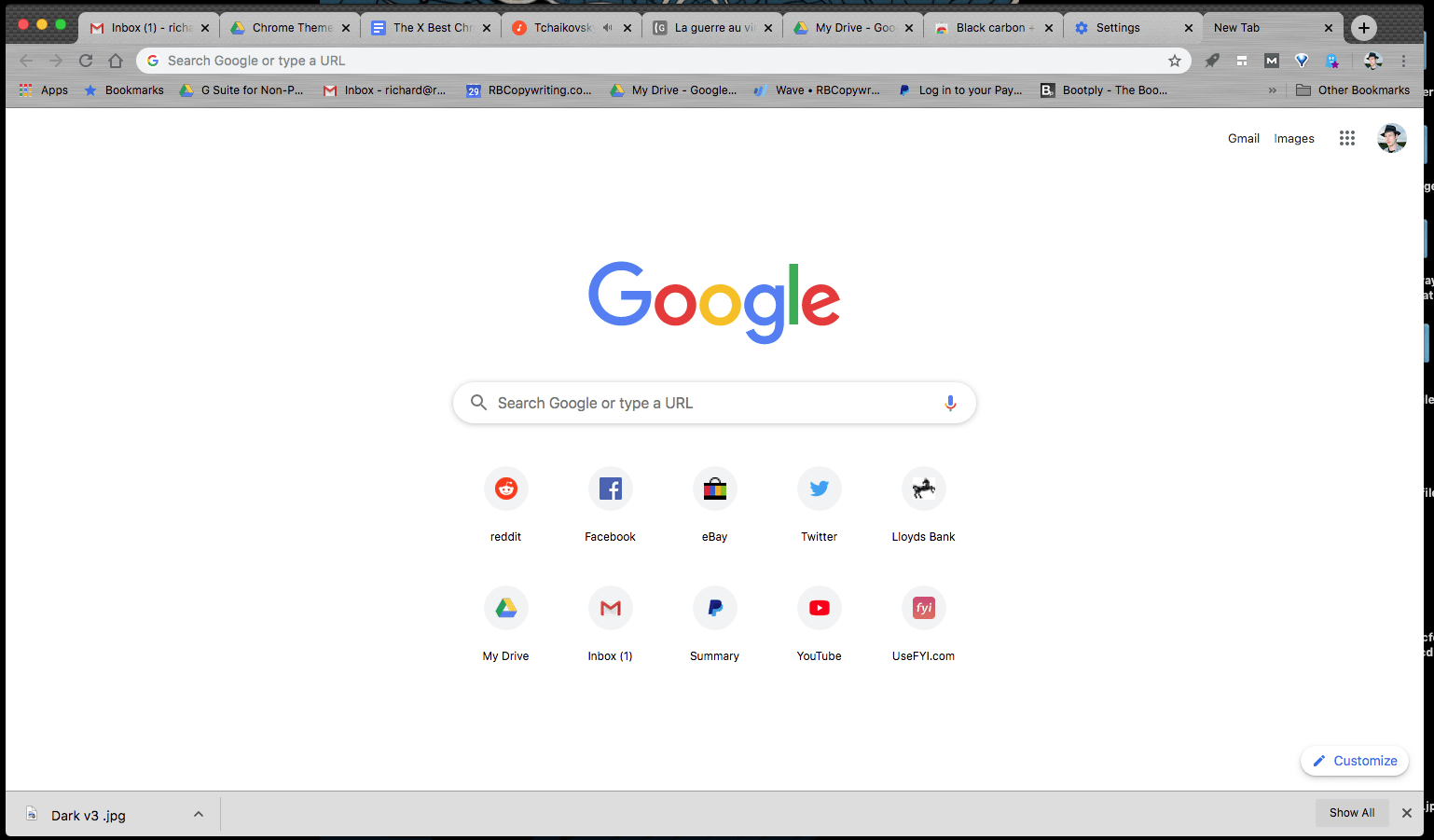
13. Black Carbon + Silver Metal
- By: bitofcode.net
- Best for: Minimal with a twist.
- Users: 400,000+
- Rating: 4.8/5
This is a simple gray and silver theme with an interesting twist. It can be hard to see where the browser window ends if the computer’s in dark mode:
Nature themes
Autumn leaves, forests, and desert skies: the perfect antidote to staring at a screen for hours, even when they’re…on the screen.
14. Amber Autumn
- By: gabcvit
- Best for: A warm mood.
- Users: 8,000+
- Rating: 4.6/5
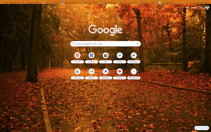
It’s a cheerful, warm theme with a strong autumnal palette.
15. Into the Mist
- By: pjatton
- Best for: A mellow mood.
- Users: 700,000+
- Rating: 4.7/5
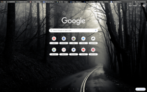
Stylish and atmospheric, this theme looks intriguing without going full horror movie. The theme imagery continues right into the header of the browser window. It looks good, and means there’s still some flavor to the theme even when you’re actually using the browser, but open tabs can be a little hard to read.
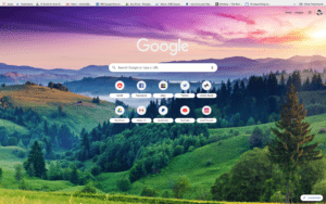
16. Beauty
- By: Atavi.com
- Best for: A whimsical mood.
- Users: 300,000+
- Rating: 4.4/5
This brightly-colored nature theme featuring a landscape shot could be mistaken for a postcard. Beyond the main theme image, there’s silver-gray coloring that makes tabs and bookmarks easy to find. It is quite bright, though—nothing about this theme is dull or muted.
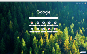
17. Nordic Forest
- By: Dmitry Mev
- Best for: Nature lovers.
- Users: 80,000+
- Rating: 4.6/5
With excellent lighting and pleasing colors, this theme is a reminder of the joys of nature. The theme imagery continues into the browser header, but it’s very muted, with solid color under tabs and bookmarks so they’re easy to read.
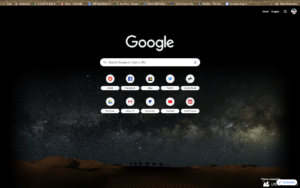
18. Sahara
- By: Peter Noordijk
- Best for: An atmospheric and restful mood.
- Users: 60,000
- Rating: 4.7/5
The theme’s main graphic is a night sky shot over the Saharan dunes. The developer explains on the Chrome Store page that the image was constructed from several shots, including one taken by his father—a nice touch. If there’s a flaw in this theme, it’s that it’s difficult to read the text on open tabs against the theme imagery. Bookmarks are easier to read because the theme imagery is grayed out underneath them.
Abstract and atmospheric
Let’s get into the stylish abstracts and atmospheric images.
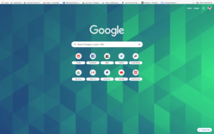
19. Blue/Green Cubes
- By: Thomas
- Best for: Its interesting but not distracting design.
- Users: 200,000+
- Rating: 4.6/5
This geometric theme is easy on the eyes. When you mouse over tabs, they change color but stay close to the base theme color, so you might have to go back and forth a few times to check.
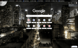
20. Night Time in New York City
- By: Thee Pupil
- Best for: Cityscape fans.
- Users: 400,000+
- Rating: 4.6/5
A dark theme with lots of lights, Night Time in New York City features a glowing artistic shot of NYC at night, catching a mood right between Gotham City and Breakfast at Tiffany’s.
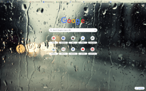
21. Raindrops (Non-Aero)
- By: Hay Hsu
- Best for: That rainy day feeling.
- Users: 70,000+
- Rating: 4.5/5
Think calming but not boring. Tabs and bookmarks are easy to see, even though theme imagery continues into the header. The only issue we could find was that the theme imagery is darkest in the top left corner of the screen, which makes the first tab and the forward/back arrows hard to see.
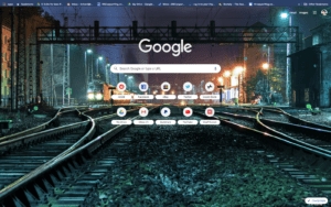
22. Midnight Train Dark Blue Theme
- By: Oleg Filonenko
- Best for: An urban atmosphere.
- Users: 100,000+
- Rating: 4.5/5
Midnight Train treats the tabs as an inset into the header area of the browser window, casting them black and the rest dark blue so everything’s easy to find. It’s a fun theme that’s atmospheric without taking itself too seriously.
Artistic themes
These come with more of a handmade feel.
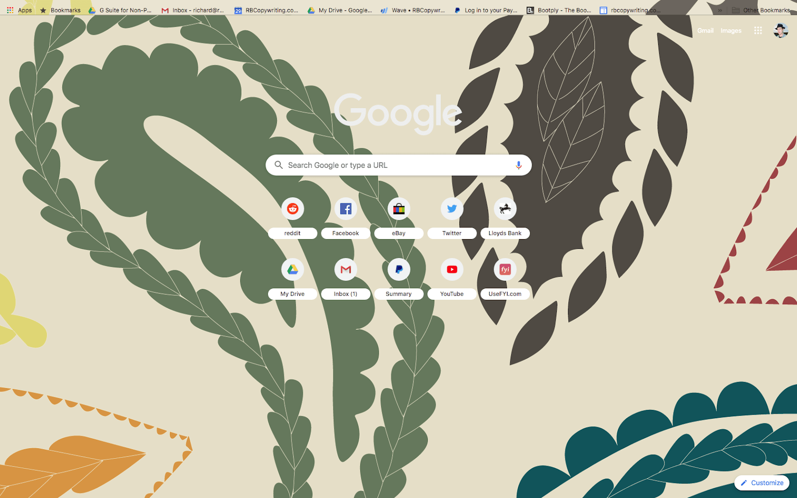
23. Harvest Paisley
- By: egano.blogspot.com
- Best for: Wallpaper style.
- Users: 10,000+
- Rating: 4.5/5
A charming, Etsy-made-my-wallpaper vibe with big, abstract nature shapes, this a fun one—but it’s bright, and bookmarks can be hard to see against the theme imagery in the browser header.
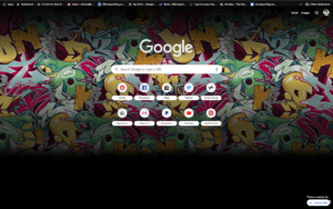
24. Marc Ecko
- By: extensions@chromium.org
- Best for: Ecko fans.
- Users: 200,00+
- Rating: 4.8/5
This graffiti art courtesy of Spike Lee and Chuck D’s buddy, one-time T-shirt impresario Marc Ecko, fades to black at the bottom of the screen. Its minimal theme branding is all but hidden behind the Customize button, and the navigation elements, tabs, and bookmarks are easy to see.
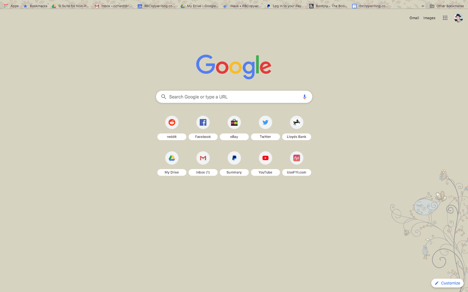
25. Doink
- By: mikeymuss669
- Best for: An understated-yet-artsy vibe.
- Users: 8,000+
- Rating: 4.8/5
A floral vintage theme featuring cute art and muted colors, this one’s a nice choice if you’re looking for a theme that’s easy on the eye but not too dark or plain.
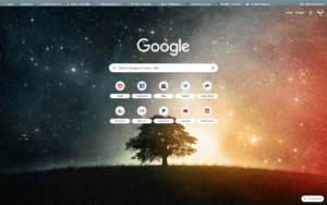
26. Lone Tree
- By: Jeremiah Megel
- Best for: Mystery and glamor.
- Users: 300,000+
- Rating: 4.6/5
This is beautiful imagery, contrasting a lone tree on a grassy hilltop with a yin-and-yang astronomical lightshow. There’s a restful dark slate-blue color under the controls, making bookmarks and tabs easy to read, but the forward/back arrows are colored the same as background, so you’ll have to find them from memory!
Comics, games, TV, and movie-related themes
The best entertainment and fandom-oriented themes in the Web Store.
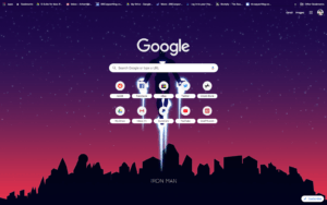
27. Iron Man — Material Design
- By: James
- Best for: MCU with an arthouse twist.
- Users: 200,000+
- Rating: 4.7/5
It’s a bit of an artsy take on Tony Stark, but it stands out against all the themes that use imagery from the films by trying to convey the essence of the character in a stripped-down, simplified, and aesthetically pleasing theme graphic.
28. The Avengers
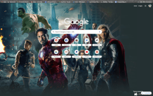
- By: Peter Noordijk
- Best for: Unrepentant MCU fans!
- Users: 40,000+
- Rating: 4.7/5
Eschewing artsy efforts in favor of a full-cast display that gives a movie-poster effect, this theme from prolific developer Peter Noordjik is the top-rated Avengers theme on the Chrome Web Store. The control areas are dark so easy to see.
29. Batman Dark HD
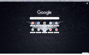
- By: wallpaper.net.in
- Best for: A steelier take on The Dark Knight.
- Users: 6,000+
- Rating: 4.1/5
Styled to reflect a grittier take on Batman, this Bat Signal theme is a dark theme with a difference. The bookmarks bar is styled gray, and open tabs are dark gray, so everything’s easy to find.
30. No Man’s Sky
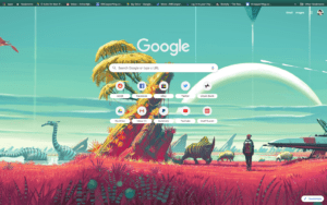
- By: eamal27
- Best for: Gamers.
- Users: 40,000+
- Rating: 4.7/5
This theme is perfect for avid players of the open-world No Man’s Sky. The theme imagery continues into the tabs and bookmarks, but control areas are dark with white text. Tabs are mint green with dark gray text, a color combination that suits the style of the theme but sometimes requires a little squinting to see clearly.
31. Steam Powered
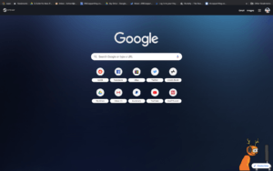
- By: danielgibbs.co.uk
- Best for: Steam lovers.
- Users: 3,000+
- Rating: 4.3/5
Steam Powered is a theme that mimics the design of the popular Steam client from Valve, with matching colors and graphics including part of the Steam logo in the top left corner under the window controls. There’s a 4K version available for higher-definition monitors.
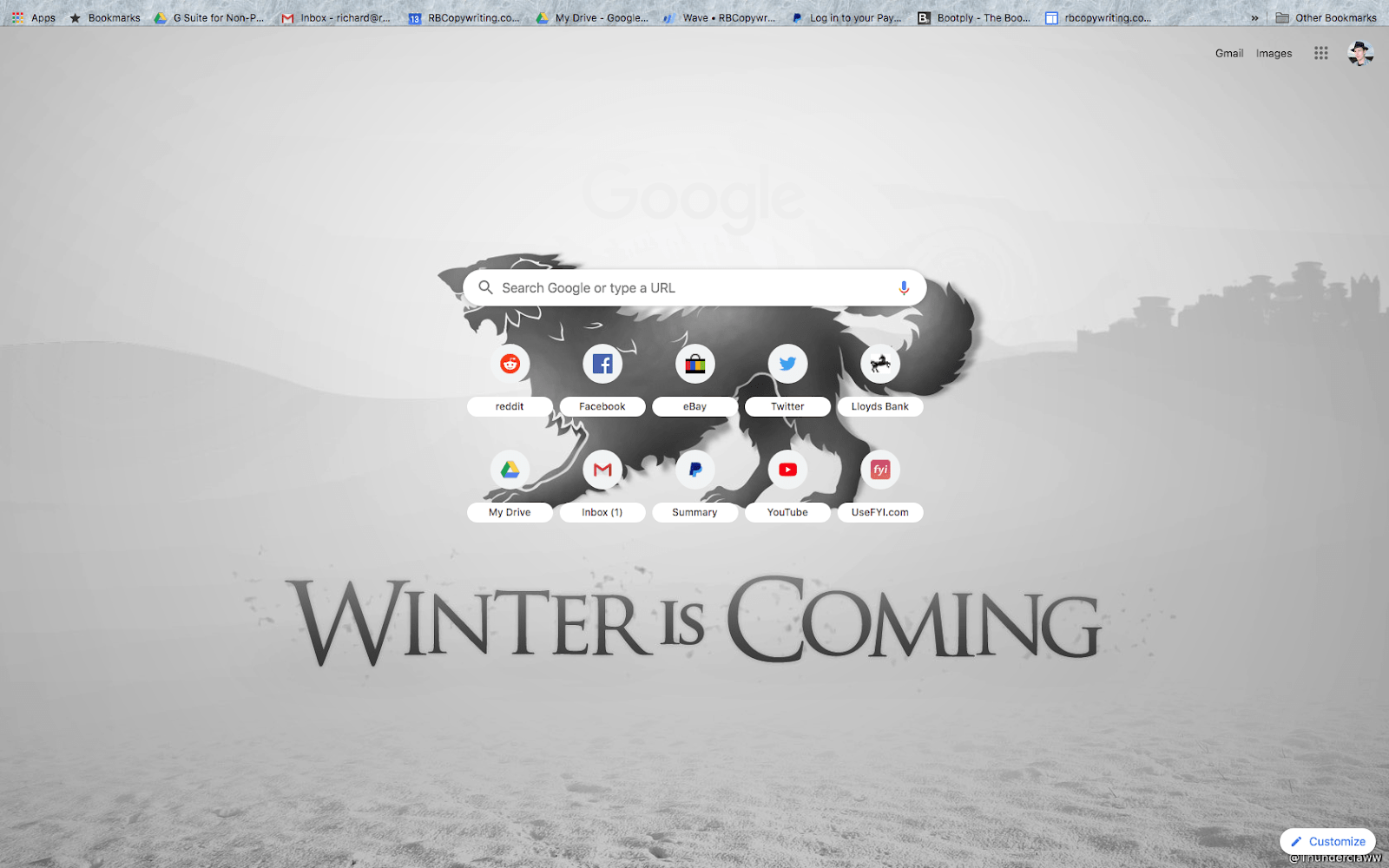
32. Game of Thrones
- By: Thunderclaww
- Best for: Thrones fans.
- Users: 20,000+
- Rating: 4.7/5
You can get Game of Thrones themes for each of the major houses, including Starks, Lannisters, and Targaeryans:
In each case, theme colors and imagery continue into the bookmarks and tabs, without compromising navigability—except that it’s tough to see the forward/back arrows.
How to install a new theme
If you’re installing a theme from Chrome Web Store, the process is simple.
Go to the Web Store, enter your chosen theme into the search box, and select Themes to remove extensions from your search results. As you’d expect from Google, the search function works pretty well.
You can Add to Chrome direct from search results, or click on a search result and read more before adding it.
How to remove a Chrome theme
You can remove one Chrome theme by adding another, so if you just want to switch themes, there’s no need to remove the one you’re using. That happens automatically when you click Add to Chrome on your new theme.
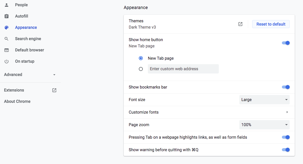
But if you want to remove a Chrome theme entirely, you can do it without replacing it with another theme by going to Settings in the Chrome menu, then Appearance, and selecting Reset to default:
Can a Chrome theme give me a virus?
A Chrome theme that’s installed from the Chrome Web Store can theoretically give you a virus. But these themes are vetted carefully, so it’s unlikely. Chrome’s reputation is on the line, after all. If you use a non-Chrome source for your theme, you can find some cool looks that are more off the beaten track, as well as a lot of poorer-quality, more amateurish work—and the risk is greater.

