How Sketch Took on Adobe by Making a Faster, Leaner, Cheaper Image Editor
When Pieter Omvlee was tasked with designing a simple drawing application as part of his computer science class at the University of Twente in the Netherlands, he set about creating a lightweight app that would fulfill his homework assignment. In the late 2000s, the vector drawing app market was a lot smaller than it is today, and it soon became apparent to Omvlee that his app had real potential.
That app was Sketch, and Omvlee’s business instincts were right on the money.
Since launching in a private beta in 2008, Sketch has amassed a relatively small but fanatically loyal following. Designed to be as lightweight and responsive as possible, Sketch lacks many of the bells and whistles favored by design industry heavyweight Adobe and its industry-leading product, Illustrator, but has positioned itself as the go-to tool for user interface (UI) designers and other creative professionals working in demanding, highly specialized industries.
Here are some of the most interesting aspects of Sketch we’ll be looking at:
- Why Sketch’s minimal UI has proven incredibly popular in the design community, even as competing products (including Photoshop) have gone in the opposite direction
- What made Sketch an ideal tool for specialized designers
- How Sketch outgrew its roots as an OS X tool and sought a broader audience by leaving Apple’s App Store
Omvlee didn’t set out to create a “Photoshop” killer app but ended up solving many of the problems faced by web and app designers—a process that began by seeking to eliminate the bloat that plagues many industry-standard software tools even today.
2008-2012: Creating the ‘Anti-Photoshop’
Pieter Omvlee was enrolled in a computer science class in 2008 when he began creating a lightweight, nimble vector drawing application for Apple’s OS X.
At that time, the indie software development scene was a lot smaller than it is today. The iPhone was less than a year old, and the sprawling app development ecosystem that we know today had yet to exist. For graphic designers, Adobe reigned supreme in 2008. Its flagship software product, Photoshop, was the undisputed king of image editing tools, and its sister product, Illustrator, was king of the vector editors. Nothing else came close to approaching Adobe’s dominance.
Although Illustrator was an incredibly powerful software program, it was intimidating to newcomers. Illustrator had undergone immense changes, particularly to its user interface (UI) with the release of Creative Suite 4, one of the most significant updates to Adobe’s Creative Suite at that time. Experienced artists and designers might be able to navigate Illustrator’s many menus with little trouble, but for casual users, the barriers to entry were comparably high.
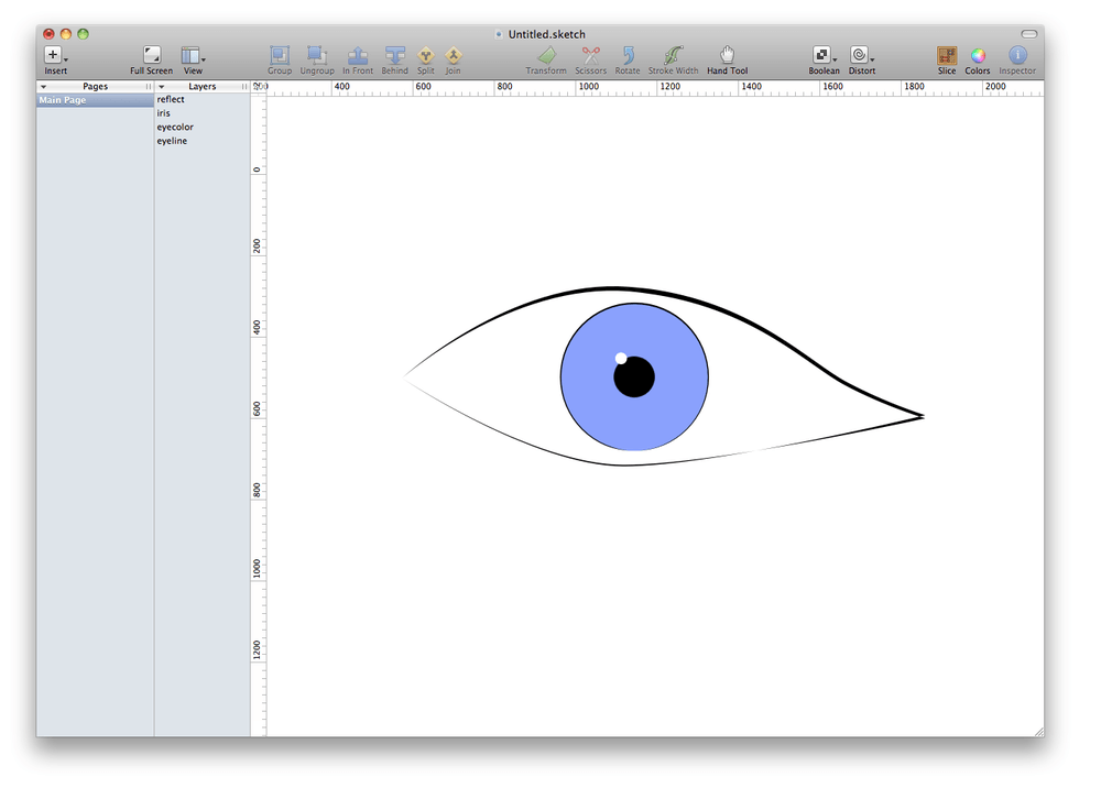
Omvlee decided to design his application to run natively on OS X. This was very smart. Although Omvlee could have reached a considerably wider audience by designing Sketch for Windows (or OS X and Windows), focusing on the Mac market was highly strategic; graphic designers tend to favor Macs due to long-held perceptions in the design community that Adobe products—and, by extension, other graphics-focused software tools—run better on Macs. Developing the first version of Sketch for OS X wouldn’t give Omvlee the biggest audience, but it would help him target the right audience—not to mention the fact that developing Sketch for two operating systems would have been too much work.The precise timeline of events leading up to Sketch’s initial launch is hazy. Omvlee started developing what would become Sketch in 2008, but beyond this, we know little about the earliest challenges that Omvlee faced when building his prototype. We do know that Sketch officially launched in September of 2010 in a private beta and was released by Omvlee’s small development company, Bohemian Coding.
We also know that Omvlee decided to monetize his product almost immediately. This wasn’t part of a larger revenue strategy; as a student, Omvlee was living a humble lifestyle and needed the modest funds that sales of Sketch 1.0 brought in. Sketch was initially priced at $49.99. Although this could have been perceived as quite steep for a product that essentially looked like shareware, it was a bargain compared to the $520 Adobe was charging for the latest iteration of Photoshop at that time.
“What I do know is that I launched the app very quickly—too quickly probably. And I started charging money for it right away. Not that I had much choice though. The very low income the first versions provided me was much needed to supplement my income during my studies.” — Pieter Omvlee, founder, Sketch
Omvlee’s decision to charge for Sketch almost immediately could have alienated some users. Instead, he used it as an opportunity to hone Sketch quickly. Paying users expect a product to work, and Omvlee actually credits much of Sketch’s early development to the “constant ‘bugging’ of customers” he was forced to deal with. This was a crucial growth opportunity for Omvlee. By targeting a large but specialized incumbent audience with a remarkably capable product at a fraction of the price of its closest competitor, Sketch was able to create and sustain incredible tailwind very early on. This put Sketch on an upward growth trajectory it could ride to greater market share and increasing specialization to meet the needs of its growing user base.
The earliest versions of Sketch were incredibly rudimentary, especially compared to Illustrator CS4. The interface was extremely minimal. Rather than relying on complex nested toolbars as Adobe did, Omvlee decided that Sketch’s core tools would be accessible from a series of simple icons at the top of the screen.
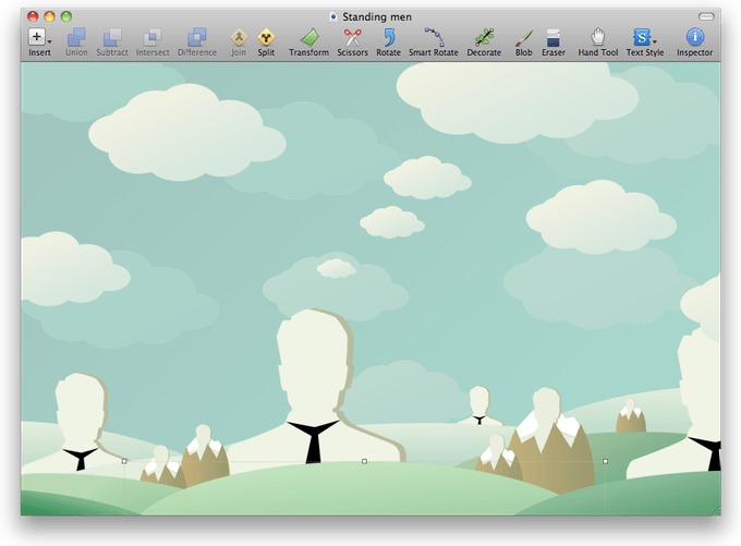
Sketch’s interface and overall appearance were deceptively simple. To the casual observer, Sketch resembled freeware, but this belied just how robust Sketch really was. Many designers were surprised—and delighted—by how nimble and responsive Sketch felt, even when working with complex vector illustrations with multiple layers. In the blog post accompanying Sketch 1.0’s release, Omvlee said that his product “launches in less than a single bounce in my dock.”
Sketch began to attract a small but loyal following in the design community. It wasn’t going to dethrone Illustrator any time soon, but Sketch soon made a name for itself as a lightweight alternative to the complexity and density of Illustrator. However, Sketch’s minimal UI wasn’t the only thing that helped it stand out. Omvlee wanted to genuinely innovate in areas where he saw opportunities, too. One of Sketch’s most useful and popular features was the Sketch Mirror companion app. Designed to run in concert between a user’s mobile device and Sketch running on desktop, Mirror allowed designers to connect their iPhones to their Macs and test their designs natively in real time on their mobile device. This might not sound particularly revolutionary now, but in 2010, this was a game-changing feature. Even Photoshop and Illustrator lacked a comparable feature. For UI designers, Mirror was a huge step forward that saved them time and effort.
“You can make changes in your document and see them in real time on any screen you have synced. I use this tool constantly for testing mobile application designs and responding to feedback at soon as it happens. What a time saver!” — Adam Colgate, BusinessDictionary
In 2012, Sketch won an award in the Mac category at the annual Apple Design Awards held at Apple’s Worldwide Developers Conference in San Francisco, California. This accolade raised Sketch’s profile considerably and broadened the app’s reach. Sketch’s recognition at the Apple awards piqued the interest of industry press, which began covering the product with more enthusiasm. Some reviewers were taken aback by the product’s streamlined UI. Some even dismissed Sketch initially as a “serious” tool because they mistakenly believed it couldn’t possibly do everything they needed it to do with such a minimal UI.
Simplifying the interface of his app wasn’t laziness on Omvlee’s part—it was a conscious design choice made to reject the conventional wisdom of mainstream image editing applications that favored dauntingly complex interfaces and ever-expanding toolbars aimed at all designers in an attempt to maintain market share. Having won a prestigious Apple Design Award for his app, Omvlee was ready to hone Sketch’s focus to be even more attractive to UI designers.
2013-2015: Sketch Finds Its Focus, Ditches Downloads for Direct Sales
Sketch had made something of a name for itself as an inexpensive, lightweight alternative to Adobe Illustrator. However, if Sketch hoped to succeed and grow further, this wasn’t going to cut it. Sketch couldn’t market itself as something it wasn’t; it needed a core identity of its own. This is what drove Sketch’s development for the next two years.
By 2013, Sketch had attracted a growing following of design enthusiasts who had actively turned their backs on the bloat and complexity of Adobe’s products. However, on May 6, 2013, Adobe announced that it was discontinuing development of and support for Fireworks, its bitmap and vector graphics editor. Adobe cited the increasing overlap in functionality between Fireworks and its more mainstream products, Photoshop and Illustrator, as the primary reason for the decision.
Adobe’s loss was Sketch’s gain.
Although Fireworks was never as popular or widely used as Photoshop and Illustrator, the program did have a considerable userbase, many of whom had used the tool since its days as a Macromedia product prior to Adobe’s acquisition of Fireworks and other Macromedia products in 2005. Suddenly abandoned by Adobe, many formerly loyal Fireworks users migrated to Sketch. Everything Fireworks could do, Sketch could do better—and faster.
The next major milestone for Sketch came the following year in 2014, when the company announced an integration with prototyping tool InVision. This partnership was highly strategic. At that time, InVision (which relied upon a freemium business model) had surpassed the 500K user mark and had attracted more than $35M in venture funding. The integration itself was smart. Users could work on live, real-time prototypes across both InVision and Sketch, allowing designers to seamlessly move between the two applications. When users saved changes to a file in Sketch, the changes were reflected in the InVision file and vice versa.
Between 2013 and 2014, Omvlee’s company almost doubled in size. As of 2014, Bohemian Coding had 13 full-time staff, which while still very small in the grand scheme of things represented a significant expansion for the company.
2014 also saw Sketch shift to an upgrade model. In an interview, Omvlee reiterated that he disliked the subscription model favored by many tech companies, but that a single transactional payment wasn’t sustainable, either. The upgrade model—which, ironically, was the same model used by Adobe prior to the introduction of its unpopular subscription-based system—allowed Omvlee and his team to continue working on Sketch and bringing in recurring revenue without asking users to pay a monthly fee.
“I absolutely agree that a one-time fee for an application is not sustainable. I also know that we don’t want to switch to a subscription model. Customers just don’t like the idea of subscribing to software. We’ve seen that when Adobe discontinued Fireworks—that was one of our biggest sales days. Adobe’s pitch was basically that you can now switch to Photoshop.” — Pieter Omvlee, Founder, Sketch
In terms of product, Sketch 3.0 was a huge update. Virtually every aspect of Sketch was improved and tweaked in Sketch 3.0, from optimizations that made Sketch even faster to improved tools, new grid features, support for more plugins and integrations, a faster and more responsive Mirror mode, and many other features. Smartly, Omvlee’s company made Sketch 3.0 available to existing Sketch users completely free. Although the company could have charged a premium for such a significant upgrade, Omvlee understood that the goodwill from making such a major update free for existing users would ultimately be much more valuable than the uptick in revenue that charging everybody for the new version would have brought in.
By 2015, Sketch had emerged not only as a cheaper alternative to Illustrator but as a fully formed product in its own right. However, what made Sketch so compelling to so many designers wasn’t its significantly lower price point—though that doubtlessly helped—but rather the depth of its tools. Seeking to dominate the entirety of the graphics space, Adobe had committed to incorporating as many features as it could into the latest versions of its Creative Suite products. Sketch, on the other hand, understood what designers and creative professionals really wanted: fewer, yet highly specialized tools designed with the unique needs of vector artists in mind.
If Illustrator was a Swiss army knife, Sketch was a scalpel.
“I feel very strongly that the depth of our features, not the scope of them has been what has made Sketch popular. We’ll gain more fans with smart little touches we add to existing features than bolting on more and more features. Bloat is something we want to avoid at all costs.” — Pieter Omvlee, Founder, Sketch
Omvlee’s development philosophy of depth over breadth wasn’t just smart from a product perspective. It also elevated Sketch’s profile in the design community. In 2015, Sketch was long-listed for net magazine’s App of the Year, an accolade the product ultimately won. Net magazine might not have been as prestigious as an Apple Design Award, but it demonstrated that Sketch wasn’t just a robust design tool but a beautifully designed product, period.
Until this point, Sketch had been available as a direct download from Bohemian Coding as well as an app in Apple’s Mac App Store. That changed in December 2015, when Sketch was pulled from Apple’s online marketplace.
In the blog post announcing the move, Omvlee cited three reasons for his decision to abandon the Mac App Store in favor of direct sales:
- Apps submitted to the Mac App Store took at least a week to be approved through Apple’s manual review process.
- Apple’s insistence that desktop apps available through the Mac App Store be sandboxed for additional security, a stipulation that was impractical for Sketch.
- The Mac App Store didn’t offer upgrade-tier pricing, a barrier that contravened Bohemian Coding’s entire monetization strategy.
“Over the last year, as we’ve made great progress with Sketch, the customer experience on the Mac App Store hasn’t evolved like its iOS counterpart. We want to continue to be a responsive, approachable, and easily-reached company, and selling Sketch directly allows us to give you a better experience.” — Pieter Omvlee, Founder, Sketch
By the end of 2015, Sketch had incorporated many of the most useful features of Photoshop and Illustrator into a sleek, minimal UI that designers found refreshing and useful. Even more remarkable than Sketch’s growing popularity was the fact that Omvlee had resisted pressure to accept external funding. Omvlee’s goal now was to grow beyond Sketch’s relatively niche userbase and offer Sketch’s simple, streamlined design tools to a broader range of amateur designers and hobbyists.
2016-Present: Designing for Non-Designers
As Sketch continued to grow, Omvlee’s personal opposition to institutional finance had begun to become something of a liability. Sketch had advanced tremendously as a product, but by 2016, growth had slowed. Regardless, Bohemian Coding forged ahead and introduced even more improvements to its growing toolset.
Sketch kicked off 2016 with the launch of Sketch Cloud.
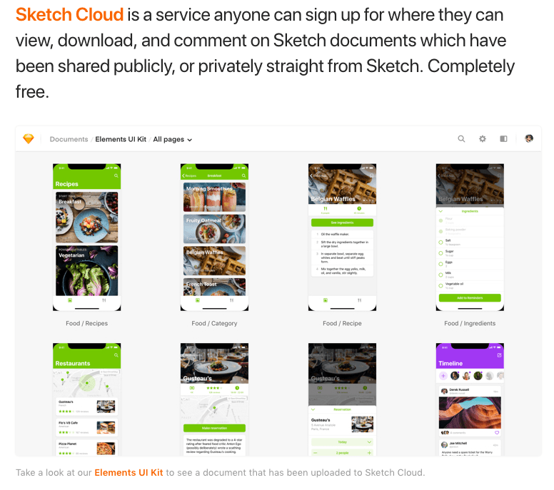
Sketch Cloud was a major step forward in allowing designers to collaborate with one another. Functioning similarly to Dropbox, Sketch Cloud made it possible for designers to work together on documents seamlessly with no file transfers. Cloud also gave users the power to password-protect sensitive documents as well as leave feedback on shared files.
Later in 2016, Bohemian Coding revised its pricing model once again. Rather than forcing users into paid upgrades for major release milestones (such as upgrading from 3.x to 4.0), Sketch would now give users one year of free upgrades. In a Medium post announcing the change, the company explained that while the milestone upgrade model was very common for software products, the company didn’t believe this approach was particularly fair.
“Customers who have purchased an app closer to the original release date get free updates for longer than someone who bought the same product halfway through its release cycle. We think a fairer approach is for everybody to get the same period of free updates, no matter when they purchased the app.”
The change in pricing also gave Sketch more flexibility in terms of product updates. Under the milestone upgrade pricing model, Sketch had little incentive to continually update the product. Monetarily, it made more sense for Bohemian Coding to hold back significant updates in order to entice users to pay for an upgrade. Under the new system, Sketch could release updates as and when they were ready—a win for loyal users and newcomers to the product alike.
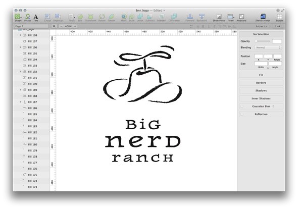
2016 also saw one of the most significant redesigns of the product since its launch. The yellow gem icon that had served as Sketch’s de facto logo was refined, and many of the product’s core icons were also improved. In typical Sketch fashion, the redesign update also included a raft of speed improvements, functionality updates, and other tweaks.
![]()
The next major update to Sketch came in 2017, when Sketch 47 introduced Libraries. Built using some of the underlying technology behind Sketch Cloud, Libraries were among the most frequently requested features from the product’s most loyal users. Libraries allow Sketch users to share Symbols—reusable elements that can be shared across Sketch’s Artboards and Pages—across multiple Sketch documents and users. This was a hugely important update for distributed teams. The launch of Libraries meant that virtual teams no longer had to rely on third-party file sharing systems to work with custom Symbols and other graphical assets. They could simply work with shared Libraries where and when they needed to.
Libraries are an excellent example of how Sketch has continually refined its core functionality to provide even more value for designers and creative professionals. However, by his own admission, Omvlee’s granular approach to everything from hiring to product development has limited Sketch’s growth. After the launch of Libraries, some analysts in the tech space began to ask whether heightened expectations in the design community and continued pressure from Adobe would force Omvlee to finally accept institutional investment. Omvlee’s refusal to accept venture funding has been good for Sketch as a product, but it has also hampered Bohemian Coding’s potential growth.
Until February 2018, Sketch still didn’t have a true prototyping function. Although many designers began their work in Sketch, they inevitably had to export their designs to another tool to start prototyping, such as InVision or the recently launched Framer. However, to shore up this potentially critical weakness, Sketch announced earlier this year that Sketch 49 would finally bring true prototyping to the product.
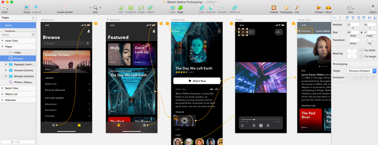
The introduction of prototyping functionality was very important for two reasons:
- It eliminated the need for designers to use Sketch alongside a true prototyping tool.
- It was a necessary step to avoid losing market share to competing products.
Sketch’s prototyping tools are pretty rudimentary and lack many of the bells and whistles that some designers have come to expect from other tools. However, that’s not the point. Sketch has always understood its place in the broader design ecosystem. Similarly, Sketch also understands that advanced features such as animation aren’t necessary to many design professionals. Like virtually every other function in its ever-increasing toolkit, Sketch is best-suited to designing quickly and iteratively. Plus, the ability to share Artboards with other users via Sketch Cloud makes it even easier for designers to do more of their work directly within Sketch.
In just a few years, Sketch has grown from an inexpensive drawing app to a remarkably robust design package aimed at a growing subset of designers facing unique challenges that weren’t being addressed by larger, more mainstream products. Sketch’s biggest challenge, however, will be navigating the increasingly complex needs of design professionals without succumbing to the feature-creep and bloat that inspired much of Sketch’s design sensibilities in the first place.
Where Can Sketch Go from Here?
Sketch has grown from a scrappy, almost-freeware product to a sleek, capable software package that can hold its own against much more expensive legacy image manipulation and vector tools—but what’s next for Sketch?
1. Splitting Sketch into separate tools.
This might seem counterintuitive, but to remain competitive, Sketch may find that siloing Sketch into distinct products by functionality could be a viable way for Sketch to refine its products to meet the needs of today’s designers without sacrificing the streamlined look and feel of the Sketch app.
2. A Windows version.
So far, developing a native version of Sketch for Windows has been dismissed as an impossibility by Omvlee himself due to the fact that Sketch was developed with OS X in mind from the very beginning. That said, by restricting Sketch to OS X only, the app is missing out on significant potential gains in market share that would be very attractive to the company as it seeks to remain relevant and continue to grow.
3. Further partnerships.
Sketch’s partnership with InVision was crucial during that period in Sketch’s growth. Although the app has grown organically over the past several years, it cannot assume it will continue to do so without hedging against emerging competition. Potential partnerships or integrations with free/inexpensive tools such as Canva may be one way Sketch can head off potential competition or challenges in the future.
What Can We Learn from Sketch?
The story of Sketch is certainly unique, but there are still plenty of lessons to be learned from Sketch’s journey. What lessons can entrepreneurs learn from Omvlee and his product?
1. Targeting a large segment of an incumbent’s audience can create incredible tailwind.
Omvlee was very smart to target a large segment of the graphics sector’s largest, most powerful incumbent, as doing so created major tailwind for Sketch. Omvlee came to market with a differentiated product that was far better than even Adobe’s flagship product.
Think about your product in the context of your market:
- First, think of your largest competitor—your industry’s Adobe. Now think about that incumbent’s flagship product. Are you avoiding taking on your sector’s most powerful players, or are you focusing on attacking their weak spots?
- If you were to compare your product with that of your biggest competitor, what could you confidently say your product does better? How is it better? And, more importantly, how are you leveraging this advantage?
- In Sketch’s case, Adobe’s rampant feature-creep and tool bloat were both very unpopular in the design community—and Sketch solved this problem incredibly well. Again, with your biggest competitor(s) in mind, what are some things that users complain about frequently? How can you leverage this dissatisfaction to encourage adoption of your product?
2. Staying true to your principles can be a major driver of growth.
Sketch could have accepted institutional investment once the product began to gain ground and grow its userbase. However, Omvlee’s refusal to accept venture funding gave him the freedom to develop Sketch as he saw fit without worrying about being beholden to investors. In addition, Omvlee’s singular focus on making Sketch as good as it possibly can be has informed virtually every aspect of Sketch’s development as a product.
Consider your product, and answer the following questions:
- Does your product do one thing really well or attempt to do lots of different things moderately well? Sketch’s relentless focus on the depth of its tools has been a consistent driver of growth for the company. Put another way, are you trying to be a Sketch or an Adobe?
- Sketch solved a major problem in the design field by being a much faster alternative to the only real incumbent player on the market. How are you capitalizing on the weaknesses of your competitors? If you had to identify just one thing that your product does better than anyone else, what would it be?
- Bohemian Coding doesn’t have a formally codified mission statement or a set of core values. All Omvlee has ever wanted to do with Sketch is make the very best vector image editing tool he could for designers everywhere. What drives you and your company? How are your company’s values reflected in your product?
3. Keep it simple.
Although Sketch incorporates tools and functionality from both Photoshop and Illustrator—notoriously complex software tools—Sketch doesn’t force its users to wrestle with poorly designed toolbars or modular UIs, instead favoring depth, not breadth, of its tools. This simplicity helped Sketch make the leap from a designer-focused tool to a more broadly appealing content creation tool without alienating its early adopters or core userbase.
Think about how it feels to use your product—and be honest:
- If you had to, how could you simplify your product? Is your product trying to “be” too many things?
- It can take weeks, if not months, to really figure out how to use Photoshop. Sketch, on the other hand, can be learned in an afternoon. How long does it take your average user to really get to grips with your product? How could you shorten the length of time necessary to learn your way around your product?
- Could simplifying your product help your users solve their problems more effectively? Photoshop and Illustrator are incredibly powerful tools, but they’re also pretty intimidating to newcomers. Are you forcing your users to learn irrelevant or unnecessary tools in an attempt to appeal to a broader audience?
From Rough Sketch to Polished Design
In today’s tech landscape, truly bootstrapped companies are the exception, not the rule. Bootstrapped companies that concentrate almost exclusively on simplicity, ease-of-use, and an incredibly tight focus are even rarer. Despite the seemingly impossible challenge of taking on Adobe, Sketch has grown from a scrappy, bare-bones design tool to a surprisingly deep, robust design product with a singular focus and a growing audience of loyal users.
There’s no doubt that Sketch will face increasing competition in the months and years to come. If the product’s journey until now is any indication, I can’t wait to see how Sketch responds to these emerging challenges.

